.jpg&w=3840&q=75)
Very often, when creating tiled navigation on a website, there is a need for its animation. This article outlines a solution to this problem using a plugin. The main principle of its operation is to split navigation elements into component sections and animate them in various ways, depending on the selected settings.
Distinctive features and capabilities of the tiled navigation plugin:
- Integration with jquery library
- Possibility of flexible parameter settings
- Many options for segment animation
- Lock gallery items to avoid multiple clicks
The tiled navigation plugin consists of the main parts:
- HTML tiled navigation markup
- JQuery script with settings templates
- Universal CSS plugin styles
Example of installing a tile animation plugin
Download the archive with the plugin and copy its contents to your site directory. For the script to work, you must have the jQuery library connected.
Archive structure:
/css/style.css              // Main styles file
/css/font-awesome.css       // Font styles file FontAwesome
/css/plate.css              // Tiles styles file
/fonts/*                    // Font files
/js/plate.js                // Main script
/images/                    // Folder with initial image set
index.html                  // File with original markup
Initializing and Configuring the Tile Plugin
The image gallery to which the script will connect must have the following structure:
<section class="plate">
 <a href="#" class="plate-item">
  <img src="/images/plate-2-1.jpg" alt="" />
 </a>
 <a href="#" class="plate-item">
  <img src="/images/plate-2-2.jpg" alt="" />
 </a>
 <a href="#" class="plate-item">
  <img src="/images/plate-2-3.jpg" alt="" />
 </a>
 <a href="#" class="plate-item">
  <img src="/images/plate-2-4.jpg" alt="" />
 </a>
 <a href="#" class="plate-item">
  <img src="/images/plate-2-5.jpg" alt="" />
 </a>
 <a href="#" class="plate-item">
  <img src="/images/plate-2-6.jpg" alt="" />
 </a>
</section>
To initialize the plugin, just specify the class of the external gallery container in the jquery selector.
<script>
 $('.plate').plate();
</script>
To configure the plugin in detail, when initializing it, you can specify in parentheses the parameters that you want to apply. (See below for a full list of available options)
<script>
 $('.plate').plate({
   count : 'auto',
   speedShow : 300,
   animateParametersShow : {
      width : 'hide',
      opacity : 0
   },
   speedHide : 300
 });
</script>
How the tiled navigation animation plugin works
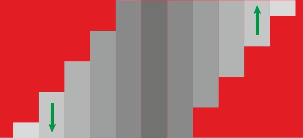
Upon initialization, the plugin creates a top layer in each gallery element, consisting of many segments, the animation of which is triggered by an event specified in the settings. Moreover, this animation can be either simultaneous or sequential, depending on the specified intervals.
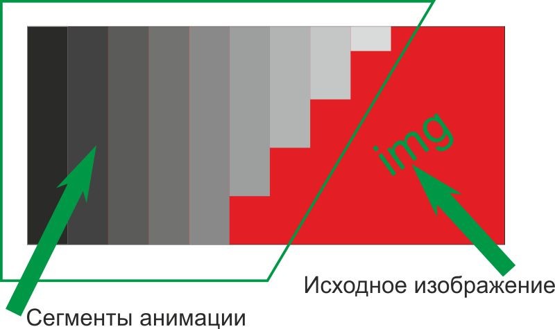
It is possible to set animation segments in the form of a whole picture, divided into separate parts, or a single translucent layer (its color can also be adjusted). In order to fill animation segments with a picture, you need to set the backgroundType parameter: 'image' and specify backgrounds for image gallery blocks in the styles.
section.plate .plate-item:nth-of-type(1){background: url(/images/plate-2-6.jpg) top center no-repeat;}
section.plate .plate-item:nth-of-type(2){background: url(/images/plate-2-5.jpg) top center no-repeat;}
section.plate .plate-item:nth-of-type(3){background: url(/images/plate-2-4.jpg) top center no-repeat;}
section.plate .plate-item:nth-of-type(4){background: url(/images/plate-2-3.jpg) top center no-repeat;}
section.plate .plate-item:nth-of-type(5){background: url(/images/plate-2-2.jpg) top center no-repeat;}
section.plate .plate-item:nth-of-type(6){background: url(/images/plate-2-1.jpg) top center no-repeat;}
Also, the background of animation segments can be set not by a picture, but by color. To do this, you need to set the parameter backgroundType : 'image' and backgroundColor : 'COLOR' .
The plugin has the ability to configure the animation speed of segments and the interval of their animation using the following parameters: speedShow , rangeShow , speedHide , rangeHide (indicated in milliseconds).
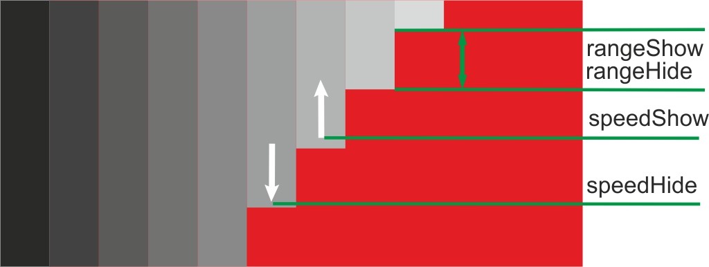
speedShow and speedHide are the time during which the animation of showing or hiding one animation segment will occur.
rangeShow and rangeHide are the time after which the animation of the next segment begins after the start of the animation of the previous one when showing and hiding, respectively.
Plugin configuration parameters during initialization
Animation can be flexibly adjusted depending on the settings, as a result of which the animation effects can ultimately differ significantly from each other.
Distinctive features and capabilities of the universal pop-up block plugin: The universal pop-up block plugin consists of the main parts:
| Parameter name | Default value | Description | Possible values |
| animationType | 'custom' | A type of pre-configured animation. | advance(manual) custom center-middle corners oval in-corner invers |
| count | 'auto' | Default number of segments | auto/number |
| defaultSectorWidth | 'auto' | Default segment width | auto/number |
| speedShow | 300 | Segment animation speed when opening | number(milliseconds) |
| speedHide | 300 | Segment animation speed when hidden | number(milliseconds) |
| rangeShow | 25 | Interval between animations of segments when they are shown | number(milliseconds) |
| rangeHide | 25 | Interval between animations of segments when they are hidden | number(milliseconds) |
| eventOpen | 'mouseenter' | Show animation start event | All standard events |
| eventClose | 'mouseleave' | Hide animation start event | All standard events |
| sectorAlign | 'middle' | Aligning animation segments vertically | top middle bottom |
| animateCenter | 'left' | Align animation segments horizontally | left right center |
| animateParametersShow | {opacity : 0, height : 0, width : 'hide' } |
Animated segment parameters when opening a gallery item | opacity width height |
| animateParametersShow | {opacity : 0, height : 0, width : 'hide' } |
Animated segment parameters when opening a gallery item | opacity width height |
| animateParametersShow | {opacity : 1, height : 100%', width : 'show' } |
Animated segment options when hiding a gallery element | opacity width height |
| backgroundType | 'image' | Segment fill type | image opacity |
| inversType | 'none' | Inversion animation type | none outer inner |
| InversSide | 'tr-lb' | The edges of the start of the inversion animation | none tr-lb tl-rb |
| backgroundColor | 'rgba(0, 0, 0, 0.5)' | Segment fill color | In rgba format |
It is also worth considering the inversion animation parameter inversType . When using it, the animation of the segments will start from two different sides at the same time, their hiding will go from the center of the gallery element to the edges ( outer ) or vice versa ( inner ), i.e. half of the segments will be conditionally assigned to the left side of the parent element and half to the right.
In addition, when using the InversSide parameter , the left half of all segments will be aligned to the top and the second to the bottom with the value tl-rb and vice versa with tr-lb . This functionality is currently only available in the beta version of the plugin and will be further developed depending on its demand in the future...
