.jpg&w=3840&q=75)
Site users = money
What is the main purpose of creating a website? In most cases, this goal is to make money. A website can confidently be called a business asset, but what should a business asset do? Bring income. Therefore, every element of the site should be understandable and easy to use. If you don't "explain" what people should do on the site or why they should do something, then they generally won't do it. Therefore, one of the main ways to present a product to the user is to use text, and text involves reading.
Text may not seem like the most important part of our lives, especially if you are not a professional writer. But a lot depends on how we formulate our thoughts in writing: whether they understand us or not, whether they listen to us, whether others do what we need, and what they think about us.
Let's talk about trends
Modern design sets its own trends in the use of fonts. Minimalism and the use of clean, “breathing” space are still relevant, so quite often designers use small font size, approximately 12 px. Where is the balance between beauty and readability? After all, you want to make a stylish layout and not provoke older users to run for a magnifying glass.
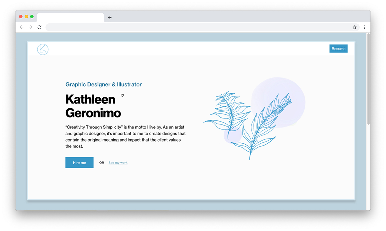
An example of using small font size.
So how many pixels?
One of the largest resources for web designers and developers, smashingmagazine.com, gives its understanding of this problem.
Smashing magazine states that if you want the maximum number of people to be on your site, read, and understand the text, then you need to set its minimum size to 16 px. The resource also provides several statistical facts that one cannot help but think about.
Almost every tenth user has vision problems (the statistics are old, so we think that today this figure is much higher). The rest, whose vision is fine, will still have to strain to read text smaller than 16 px. Even if users don't notice that they are straining their eyes, they actually do it anyway. The more difficult a text is to read, the less likely it is to be read. This means that the user will read less information than he needed, and therefore understand less. Using 10 px on a website is completely pointless, and 12 px is still too small for most readers.
A good font is like a harmonious community of people where no one behaves provocatively
But a question arises, because users can enlarge the text on the same desktop using keys on the keyboard. But again, statistics show that precisely those users who really need this increase simply do not know about this opportunity and function, or simply do not want to do it; it is easier for them to leave the site than to continue to strain their eyes. As a result, it turns out that because of the font size, a business can lose potential customers, and, consequently, money.
It is also necessary to take into account the features of the font used in the project. For example, fonts from the Futura family are approximately 10-15% smaller in size than fonts from the Helvetica family when both are set to the same size.
Link to Smashing magazine article: https://www.smashingmagazine.com/2014/09/balancing-line-length-font-size-responsive-web-design/
Examples of readable font sizes.
What about headings?
There is no universal recipe for determining the optimal size of the main heading. The design of the site, and, consequently, the size depends on the problem being solved. The main rule of any headline is that it should be noticeable. The title, as a rule, carries a specific semantic thesis, and the designer can make it highly contrasting with respect to the text in order to strengthen the message. Or use this method as a design technique.
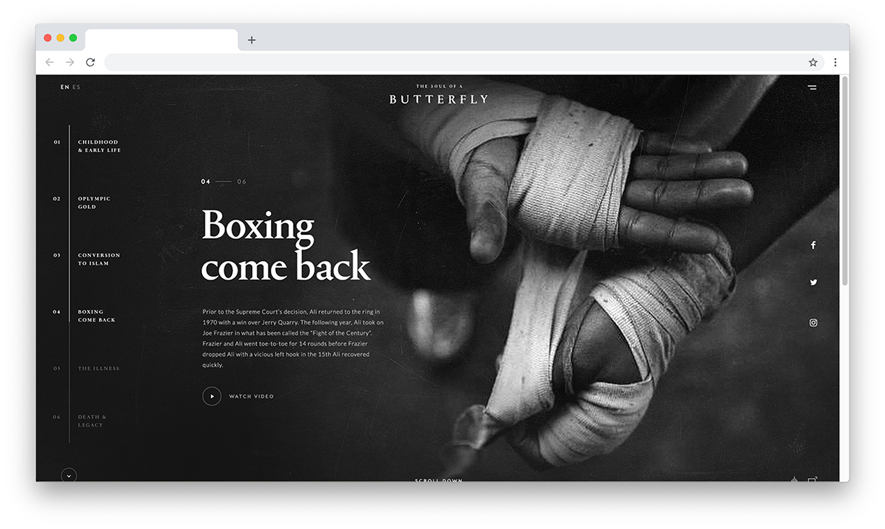
An example of a site with a contrasting header.
This technique mainly concerns the H1 heading. Statistics show that the most popular font sizes for headings are in the range from 18 to 29 px.
More specifically in numbers
General values
Below are some values based on an analysis of resources and articles on the topic of font sizes.
- Most often, font sizes from 14 to 18 px are used for body text.
- To get the optimal heading size, you need to multiply the size of the body text by 2-2.5.
- In order to find out the optimal leading (space between lines), you need to multiply the font size by 1.48.
- The spacing between paragraphs is approximately 1.39 times greater than the leading within paragraphs.
- The line size is 100 characters with a content area size of 1070 px.
When using font values, you must take into account the features of the font and the purpose of the project, without blindly relying on numbers. One of the main tips is to use your gut instinct. Sometimes it makes sense to abstract from the “beauty” of the layout and analyze the text from the point of view of readability.
Adaptive layout
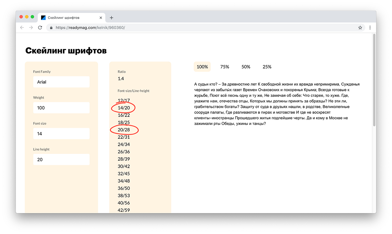
All modern websites are responsive. Websites are created to display the site on multiple screen resolutions. As the resolution decreases, a “jump” occurs from one screen composition to another (breakpoint). Font styles change with each subsequent breakpoint. This raises the problem of font proportions. If on the desktop version the font size is 20 px and the leading is 28 px, then on a mobile device the font size is set to, for example, 14 px, and the leading can be 16 px or 20 px. In such cases, the designer must sit and calculate the values on a calculator...or use font skating and simplify his life https://readymag.com/kelnik/960360/
A script from the design bureau "Design Kabak" designpub.ru helps calculate font size ratios and leading. With this tool, it is clear that a desktop paragraph of 20/28 px will be 14/20 px on a mobile device.
Conclusion
The convenience of the site lies not only in a clear interface and stylish design, but also in the readability of the text. A website with readable text is head and shoulders above the competition. Correctly selected fonts and size on the site are a quality that a person visiting your site may not notice, but will definitely feel!
