.jpg&w=3840&q=75)
In this article, we will help you understand the correctness of website design and structure for its visitors, as well as determine whether the strengths of the company are maximally displayed and how quickly a guest finds the necessary information or even makes a purchase.
Before starting to analyze the site, view it as an ordinary user from the outside — is everything comfortable and clear, is it easy to find your way, where you came from, do all buttons and links work, is the information placed correctly, is there anything that hurts the eyes, is there anything useless or unnecessarily repetitive, and what would you add for more company promotion and for a more convenient experience on the web resource. Often, companies use template websites. They may look nice in terms of design and structure, but very often, due to their universality, they do not reflect the specifics of the company's direction and lack uniqueness. The difference between a template website and a non-template one is that the former is based on structure rather than the company's activities, while creating a website from scratch begins with a detailed technical specification, which reflects the company’s principles, emphasizes the strengths and services of the company, and only after that, the structure of the site is formed.
When we have analyzed the site from the visitor's convenience perspective, let's move on to the design and functionality part:
The homepage should gather all the "best" things from the site — brightly present the company through key elements using "strong" photos, icons, and contrasting-sized texts (it is important not to overload the homepage with too much text). It will also be a great advantage to use the company’s branded fonts and colors on the site. Internal pages should be 95% similar in design (background, buttons, text, headers, photo placement and styling), but should convey information according to their specific topic without the additional embellishments that are characteristic of the homepage. However, if we are talking about a brand site, playing with design elements is appropriate.
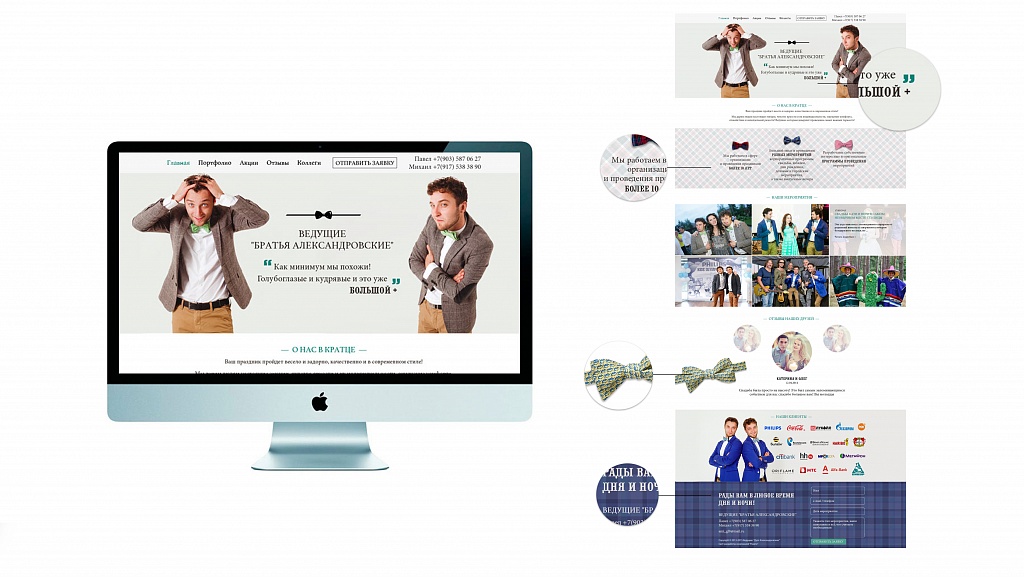
It is also appropriate to highlight key points with a large font size, a different color (according to the company’s style), or italics. BUT! The most important thing here is not to overdo it so that the "wandering eyes" effect does not occur.
The website must reflect the company’s style. For example: a beauty salon — create a sense of harmony, luxury, and beauty; a car workshop — somewhere in the footer, a car racing at high speed, speedometer numbers, graphical shapes, sharp lines, masculine sporty colors... All of this depends on the exact brand styling, as there can also be a men's beauty salon and a car workshop for women's "bugs".
The website must feature dynamics: scrolling banners, button highlights (but without overdoing it, like on old websites), sliding text.
Must have! The user should not see where the "body" of the site begins and ends (the working part where the site is located). Most often, this appears as a light-colored border on a dark background. This should not be! The website should smoothly transition from the body to the background without visible boundaries. This is very important! (It looks especially bad on wide monitors.)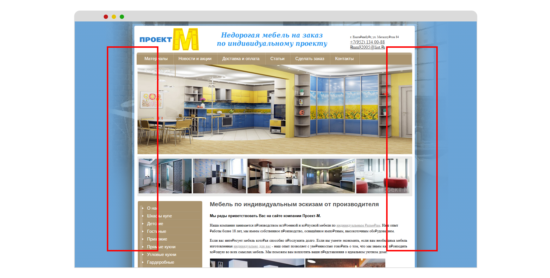 It is very important to have a full-fledged navigation, as well as a complete footer: company name, logo, contacts, copyright, and optionally social media links, all done in the website’s style! And also, a contact form.
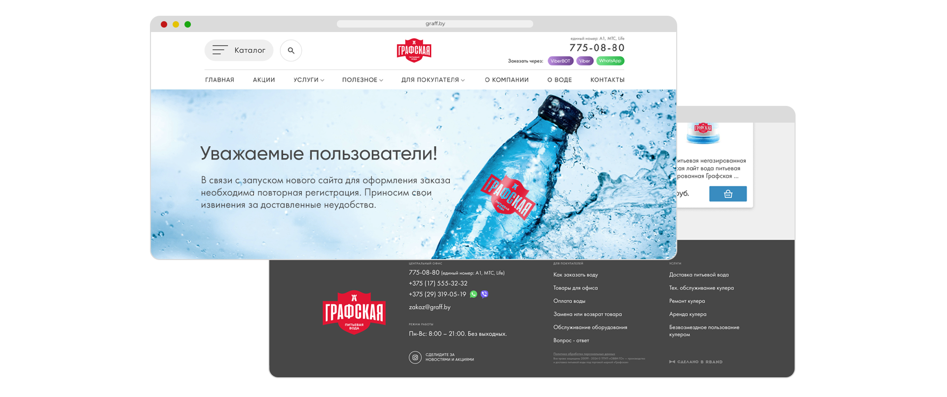
When entering the site, we should not see any distinct stumbling blocks, frames, or inappropriate highlighting. The website should have a harmonious order, comfortable for the user’s eyes.
If there is an online consultant, the consultant should always be closed by default and appear only when clicked or pulled out.
It is better not to upload low-resolution photos from a personal phone to the site. If possible, it is better to use the services of a professional photographer or take more presentable photos from the Internet. It is also considered poor practice to upload thumbnails that only enlarge by 20% when opened. The best solution is to display the full-size photo at the top or on the side, with switching thumbnails placed next to it.
We are moving towards increasing the flow of information while simultaneously simplifying its presentation for the user. Therefore, the fewer clicks, scrolls, and unnecessary transitions to previous pages (the option of short news notes, which can be switched using the titles displayed on the left, — the need to create a page with just the titles disappears), the better!
And the final point — outdated! Many think that if they made a website five years ago, it is still relevant. Those bright buttons with frames and shadows, ugly cut-out photos in frames, incomprehensible multicolored tables, huge text blocks — all of this is long gone.
Now let's break down some points page by page:
Homepage
This is the general presentation page of the company, where there should be a little bit of everything from each page of the site, with possible links to internal pages, without relying on navigation (so-called internal linking). The homepage should also immediately "capture" the person with an interesting and concise design and highlight the company’s strengths that increase its rating among others.
What must be on the website by structure:
- when clicking on the logo, the homepage should open;
- presence of the "Homepage" page title in the main top navigation;
- if necessary, the presence of contact information at the top of the page + callback order or transition to the contact form;
- the top header should not look overloaded and should be logical, even with a large amount of information;
- display part of the information through photos, thumbnails, or icons;
- no overload with texts;
- placing textual emphasis in the form of short phrases written in a different font/bigger size/highlighted with a different color/placed unconventionally on the site;
- design dynamics;
- presence of a full footer.
Internal pages
These are pages that show information about the company in more detail. The design of these pages should be more simplified compared to the homepage, as their main task is to display information according to their name. Also, pay attention to whether the title matches the content and if there is an opportunity to combine certain pages. For example: combine "Services" and "Pricing" if both pages repeat each other; combine the company’s history and its awards/achievements into the "About the Company" page; combine "Catalog" and "Photo Gallery" if the latter reflects the former.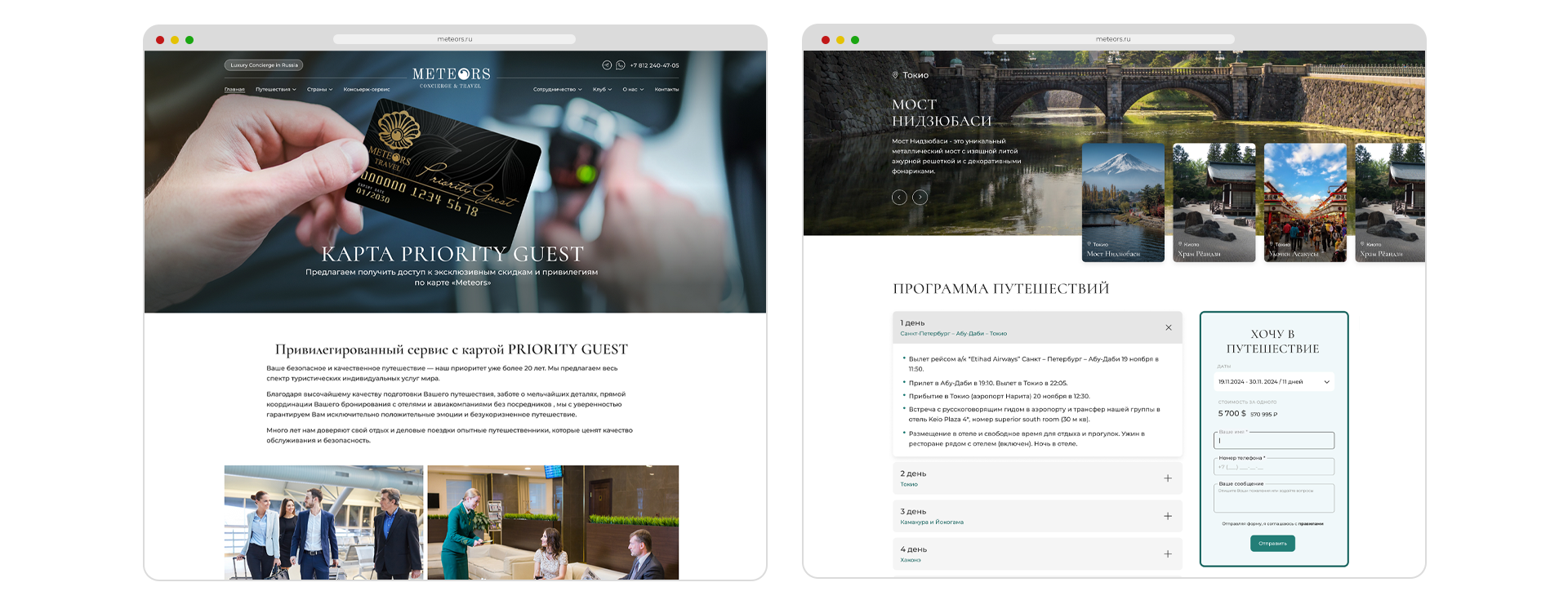
"About the Company" Page
If there is a large text page, such as "About the Company," it is better to dilute it with photos, quotes, subheadings, and spacing between paragraphs, but not overdo it. The same applies to pages like "Partnership," "FAQ," etc. Here, we can use the same techniques, but in most cases, without photos.
"News" Page
If possible, make a news switcher on the left by titles, and thus reduce the number of clicks by half. If there are many news items and they are large, do it the standard way — a page with a general list and separate pages for each news item. It’s better to accompany texts with high-quality images across the entire width of the text block + possible key quotes from the text.
"Contacts" Page
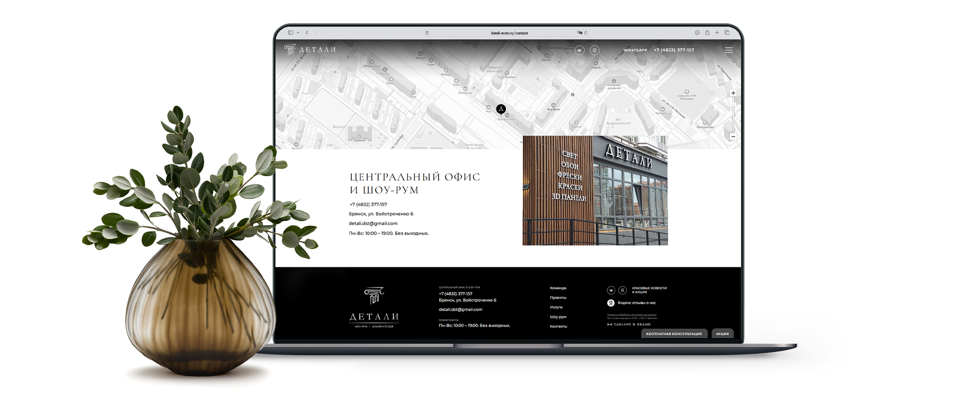
If a map is needed and it is not in the footer, it’s better to place it on the "Contacts" page across the full width of the site and make it interactive, rather than in an image format. This will help visitors orient themselves more easily, see what’s around, and even view their route. If there is no feedback form in the footer, it’s a good idea to place it additionally on the "Contacts" page. Duplication of contact information will also not hurt, even if it repeats in the footer. If possible, write about working hours and days, and also add a welcome message for visitors such as... "we thank you for visiting our site," "we will respond within 24 hours," "we look forward to new connections," and so on.
If you have an online store or are planning to create one, it is important to know the following — you need to convey information to the customer as quickly as possible, accompanied by high-quality images and displaying key information (name, price) both on the page listing all products and on the product’s internal page with more detailed descriptions. A convenient filter for company products and search by product name and brand are also important. All of this will help minimize the time spent searching and make the purchase of the needed item quicker and easier.
That's all! Thank you for your attention and good luck with creating websites!
