.jpg&w=3840&q=75)
When you think about monitors and displays of various devices, one of the first terms that comes to mind is screen resolution. Also, many manufacturers put it at the forefront of describing the quality of the screen, but is it really that important? Today we’ll figure out how screen resolution affects our perception.
Screen diagonal in inches and centimeters
The width and height of the screen are chosen to match a small set of standard values (ratios), which we will tell you about now.
Screens with a ratio of 4:3 and 5:4 (Width:Height) are a thing of the past; now they are practically not found on sale. The most popular ratio is 16:9. Less common are 16:10 and 21:9 screens. To make it easier for the user to navigate the screen dimensions, we present a table that relates the diagonal to the width and height. In the table, for each diagonal value in inches, the value of the same diagonal in centimeters is given, as well as the width and height.
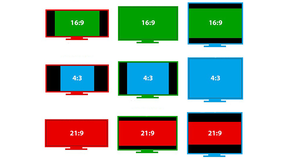
What is monitor aspect ratio?
Monitor aspect ratio, like any ratio, is a proportional representation expressed as two separate numbers separated by a colon. In the case of monitors and displays, aspect ratio describes the relationship between width and height. Common monitor aspect ratios include 4:3, 16:9 and 21:9.
Aspect ratio 4:3
Otherwise known as “full screen,” the four-by-three aspect ratio was once the standard for movies, broadcasts, and computer monitors in the 20th century. With the advent of HD resolution, the 4:3 format is no longer as common.
Aspect ratio 16:9
The 16:9 aspect ratio, also known as “widescreen,” is the international standard for all things high-definition. Since its popularity has surpassed 4:3, 16:9 can now be found on DVDs, televisions, movie theaters, and video games.
Aspect ratio 21:9
Twenty-one by nine aspect ratio is the marketing term used to describe 64:27. As a logical next step from 16:9, the current international standard 21:9 has not yet fully penetrated the market. Until now, its use has been limited to ultra-wide computer monitors and televisions, as well as cinematic widescreen projectors.
Monitor aspect ratio comparison
4:3 vs 16:9
When viewing content, the 4:3 full-screen mode produces a more “boxy” image shape, while the 16:9 widescreen format produces a more horizontally elongated image. In general, 4:3 gives a cropped feel, while 16:9 results in black bars at the top and bottom of the screen.
16:9 vs 21:9
Given the newness of 21:9, it lacks widespread utility, meaning it's rare to find a need for such a wide screen. However, support for such screens is growing every year. Compared to 16:9, 21:9 advertises the absence of black bars at the top and bottom of the screen when viewing content.
Screen resolution
Monitor resolution describes the visual dimensions of any display in terms of width and height. The image on your computer screen is made up of thousands or even millions of pixels. The screen creates the image you see by changing the colors of these tiny square elements.
Screen resolution tells us how many pixels your screen can display horizontally and vertically. This is described in the 1920x1080 specification. In this case, the screen can display 1920 pixels horizontally and 1080 pixels vertically.
For example, screens of different sizes may have the same screen resolution. You may have a laptop with a 15-inch screen and a resolution of 1366x786. You can also have a 21-inch monitor on your desk with the same 1366x786 resolution.
Screen resolution tells you how many pixels your screen can display horizontally and vertically.
In this example, although the monitor on your desk is larger, you won't actually be able to fit anything extra on it. The total number of pixels is the same.
Screen scaling
As already mentioned, screens of different inch sizes can have the same pixel resolution. This results in the same amount of content being displayed on both screens. However, on a smaller screen the content will be correspondingly smaller (for example, the text will become difficult to read). To achieve this, the ability to zoom the screen was introduced (which is often enabled by default for users). For example, if the screen pixel size is 2560x1440 or higher and the physical size is 12 inches, the operating system changes the pixel coordinates and dimensions used in the application by 180%. From an application perspective, a 2560x1440 screen has a size of 1422x800 pixels. Standard scaling options may be 75%, 125%, 140%, 150%, 180%, and 200%, depending on screen size, recommended screen resolution, and OS.
Optimal distances from the eyes to the monitor at different diagonals
The human eye is designed in such a way that it normally perceives an image that deviates no more than 20 degrees vertically and horizontally from the axis perpendicular to the screen plane.
This can be achieved if you place the display at a distance from the eyes one and a half to two times greater than the diagonal of the monitor. It is easy to calculate for which diagonal what distance is recommended:
- 20 inches – 75–100 cm.
- 22 inches – 82–100 cm.
- 24 inches – 90–120 cm.
- 27 inches – 100–135 cm.
However, according to statistics, with a monitor size of 20-24 inches, the distance from the eyes to the monitor for users is on average 60 cm. And among gamers this distance is even less. In this connection, the user perceives small text, 16px in size, better. But it’s more difficult - everything that goes beyond the content area (accepted as 1000px).
The human eye perceives an image that deviates no more than 20 degrees vertically and horizontally from the perpendicular plane of the screen.
The human eye cannot work with small objects for long periods of time. This is why the sizes of characters on the screen are standardized.
For example, the angular size of a sign (the angle at which a sign can be viewed without reducing readability) should be between 16 and 60 arcminutes (a unit of measurement for angles equal to one-sixtieth of a degree), which is between 0.46 and 1.75 cm if the user is looking at the screen from a distance of 50 cm.
Eventually:
To create a user interface, you need to consider the following factors:
- Different screen sizes.
- Differences in screen resolutions.
- Screen scaling.
- Screen proportions.
- Distance from eyes to screen.
Consequently, to maintain the most comfortable user experience of the interface, it is necessary to take into account not only the screen resolution in pixels, but also their size in inches. Both the scaling and the distance from the user to the monitor depend on this ratio. After all, the smaller the monitor, the closer the user’s eyes are to it. For example, for a mobile device it is approximately 30 cm, and for 20-inch monitors it is 50-60 cm. From which it follows that the size of the elements should change for different cases.
Conclusion:
All criteria, factors and decisions of an interface designer (in printing, advertising products, etc.) are reduced to the actual size of design elements in the metric measurement system (for example, millimeters).
Depending on the distance from the interface (which can be any items and objects, for example: an advertising stand, a label on a product, a monitor screen, license plates), the designer selects the actual size of the element so that the user’s visual organs can comfortably interact with the interface.
