(1)(1).jpg&w=3840&q=75)
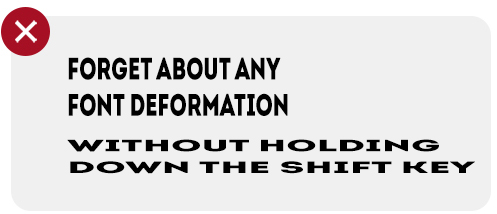
1. No deformation without holding the Shift key
Want to make a designer's eye twitch? Stretch or compress fonts disproportionately in front of them!

2. Too many accents are worse than too few
Underlining, bold, and italics are used to highlight key words/phrases, but don't overdo it. It confuses the reader and reduces readability.

3. Main text in uppercase
Main text in uppercase is hard to read and looks unaesthetic. It can be used, but only for short headlines.

4. Differentiating hyphens and dashes
A hyphen – is a spelling mark, part of a word, and written without spaces: for-example, someone-else. A dash – is a punctuation mark, placed between words, with spaces on both sides.

5. Ragged text
In typography, this refers to an uneven edge of a text block. A good designer will always find a way to make paragraphs neat. Uneven and irregular edges look unaesthetic.

6. Too large/small kerning
This is the spacing between letters in a word. A word can look untidy when the spacing is poorly adjusted.

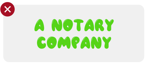
7. Inappropriate font
Every font has its own style and tone, and therefore its proper use. Agree, it would be strange if a law firm used the playful, bouncy letters of Comic Sans.

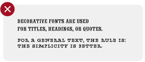
8. Overdecorating
Have some beautiful decorative fonts? Great! But that doesn't mean you should use them for paragraph text. For body text, it's better to use more classic fonts (Arial, Helvetica, Futura). The simpler, the better!

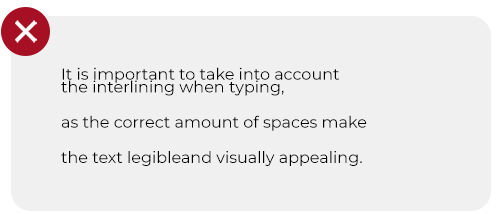
9. Insufficient line spacing
This is the space between lines of text. It's very important to choose this spacing correctly. As a rule, the optimal spacing is calculated by multiplying the font size by 1.5.

10. Poor readability
Perhaps the most serious mistake of all. Everything is done to make the reader's life easier. Dark text on a dark background may be creative, but it's not always readable. A beautiful but illegible font will ruin your idea.
