.jpg&w=3840&q=75)
Task:
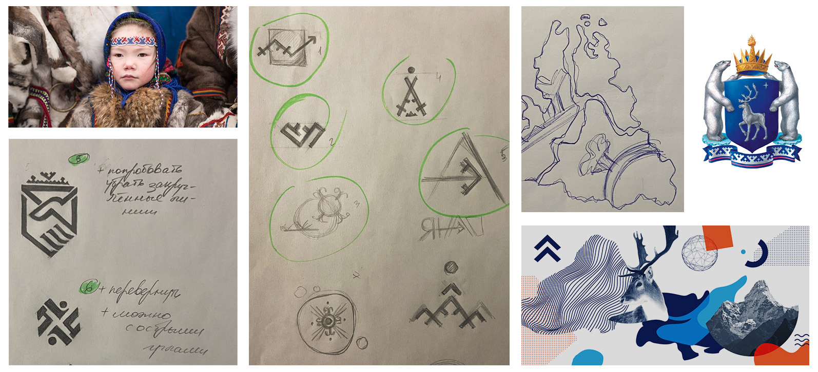
Develop a logo, POS materials design and visual brand code. To combine the rigor of a state institution, the Department of State Order of the Yamal-Nenets Autonomous Okrug, and the vibrant culture of the region.

WHAT ARE YOU, THE END OF OUR NATIVE LAND?
HOW TO DEPRESENT ALL THE MULTIFACES, WEALTH, NATIONALITY AND FASTER DEVELOPMENT OF YOUR OWN?
Solution:
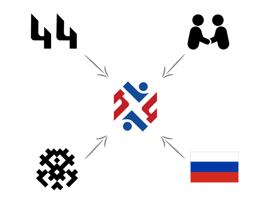
The logo included the following symbols:
- 44 – number of the federal law under which the Department carries out its activities:
- Symbolic image of 2 people – participants in bidding and procurement;
- Geometric style - similar to the geometry of edge patterns;
- Blue and red are the traditional colors of the ornaments of local peoples and the colors of the Russian flag.


Today Yamal is a unique, rapidly developing region that successfully solves government problems. It allows you to evaluate the results of the outgoing millennium. See the prospects of the future. Both the past and the present were created and are being created by mastering and inhabiting the high latitudes of Russia, courageous, kind people - the main wealth of our northern country of Russia today and always.

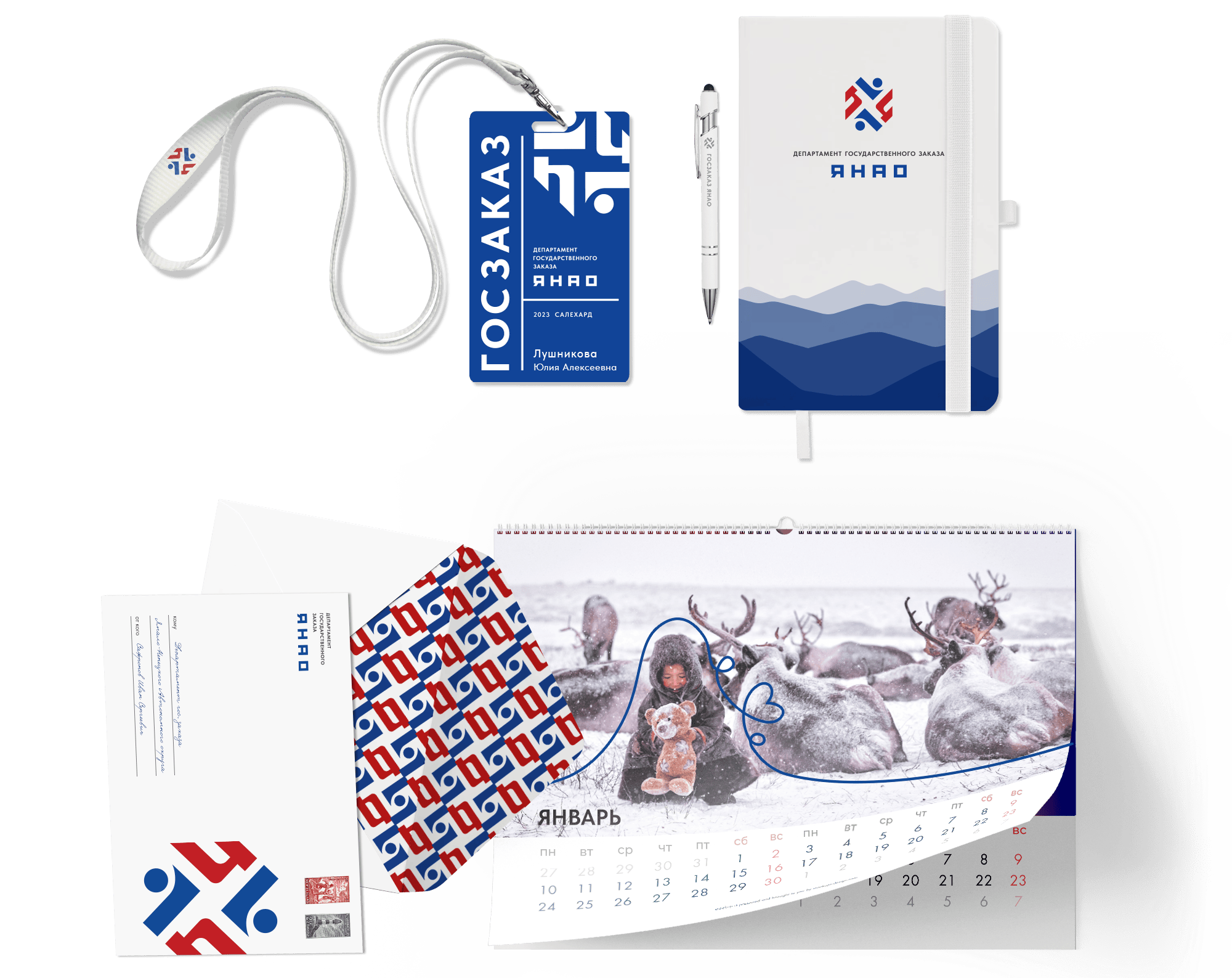
We also developed a brand book and printed materials for the Forum “State and municipal procurement: recent changes and practical aspects. 2023" and corporate gifts.
In them we reflected the whiteness of the snow, the blue of the ice and the kindness of the local residents.

