.jpg&w=3840&q=75)
Task:
Fishka Spain is a gastronomic travel project in Spain. Our goal was to reflect the atmosphere of sophistication, uniqueness, enjoyment of life, food and travel in the branding.
Solution:
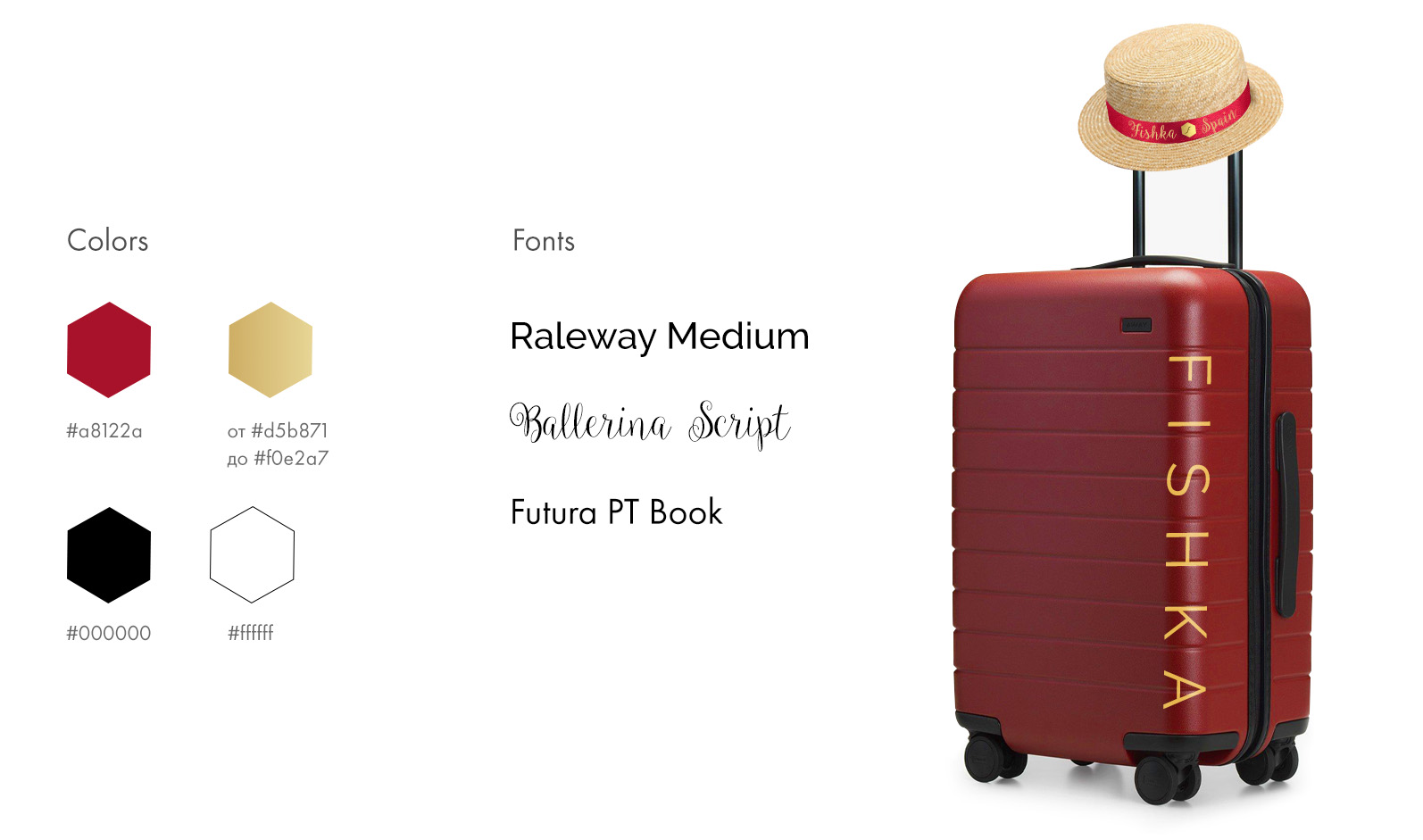
For the logo design, a laconic European style was chosen without unnecessary elements, emphasizing the premium quality of the brand. It is based on a regular hexagon, which in many cultures symbolizes abundance, harmony, and freedom. Inside it is the first letter of the brand name “F”. Emotions were planned to be conveyed through photo and video content of printed and online materials.
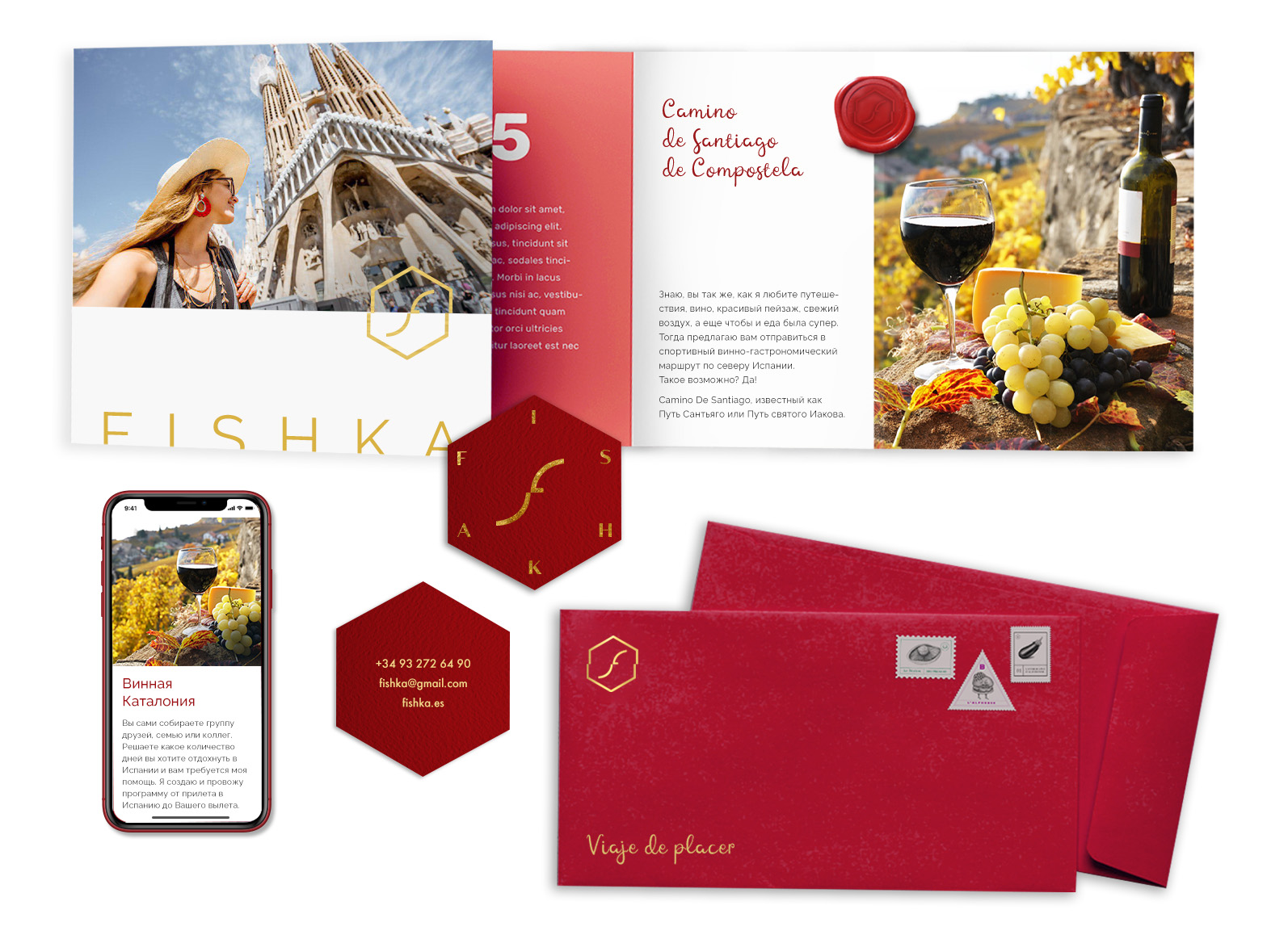
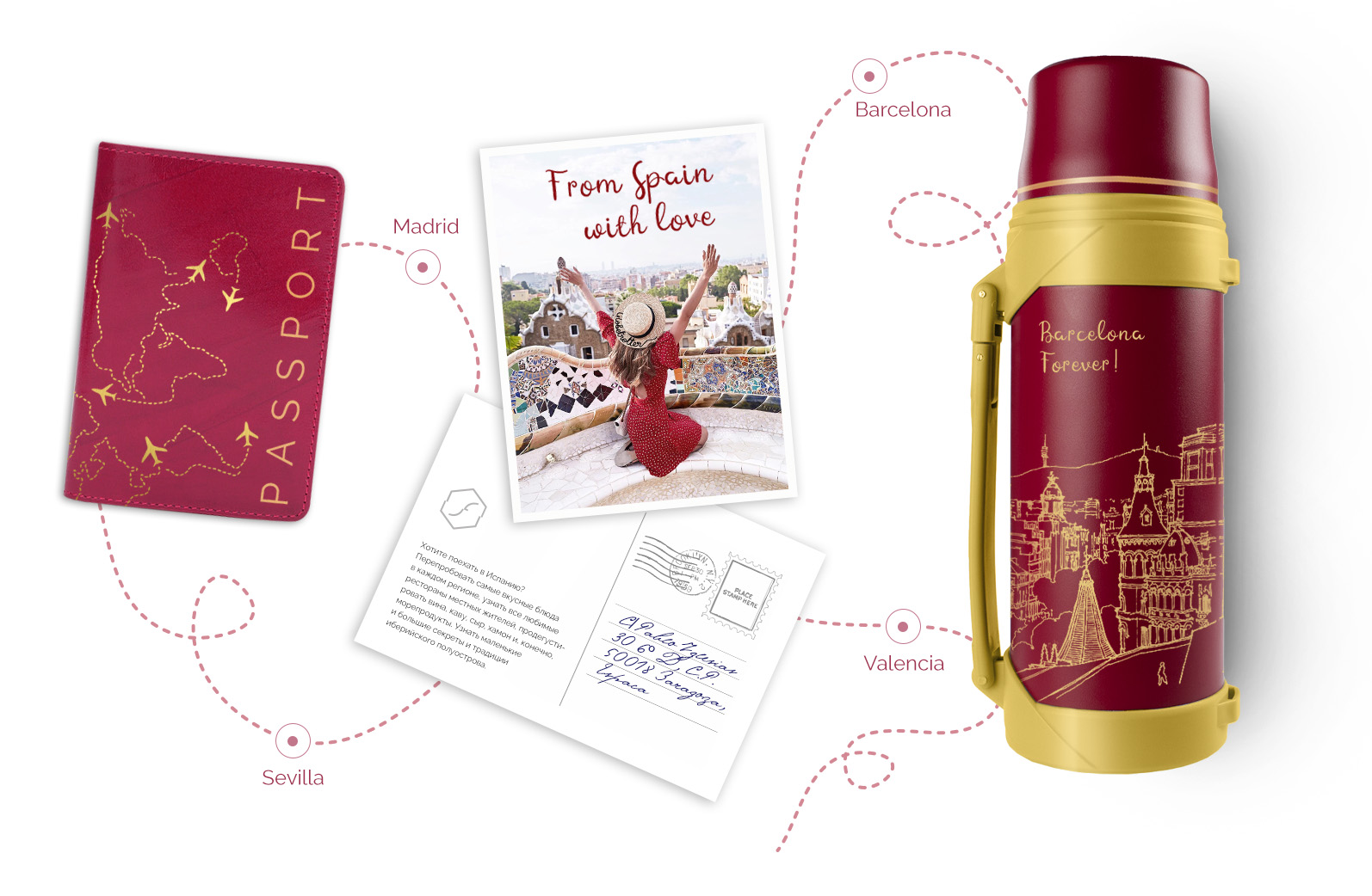
Branded materials immerse you in the atmosphere of royal Madrid and artsy Barcelona. Tactilely pleasant materials are used for printed products to engage not only visual perception, but also touch.
I want a cool project
Logo and corporate identity for the personal brand "Fishka", Spain
Creating a logo and corporate identity is a difficult task, but rb and did it brilliantly. All elements convey the uniqueness of our brand, and stylish solutions add professionalism to every detail. Victoria is a master of design.
.png&w=256&q=75)