(1).jpg&w=3840&q=75)
Task:
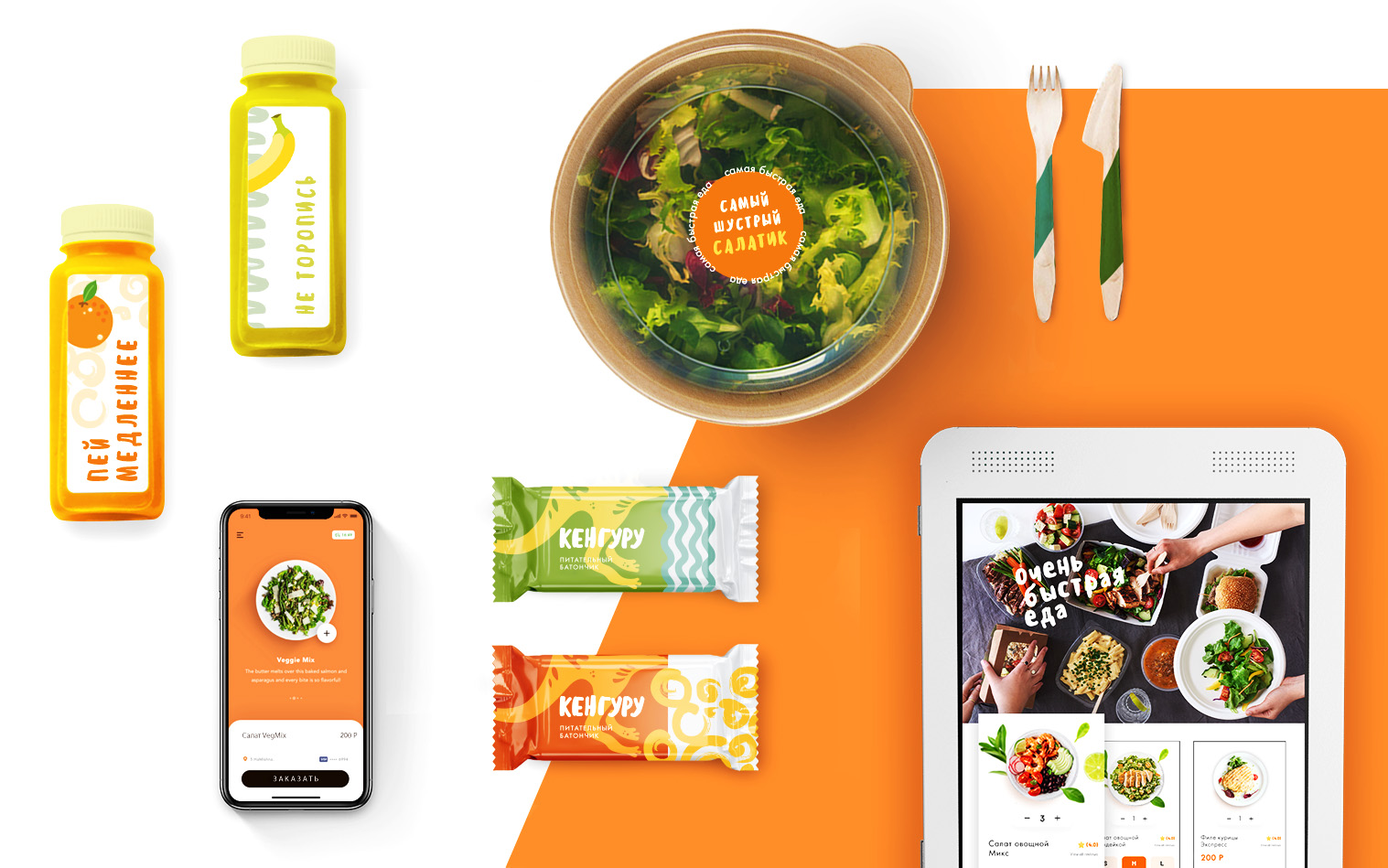
Create a bright and memorable design for printed materials and product packaging. To convey through the brand the atmosphere and idea of the business model established by the customer, namely, to focus on the high speed of preparing food while maintaining its benefits.

Solution:
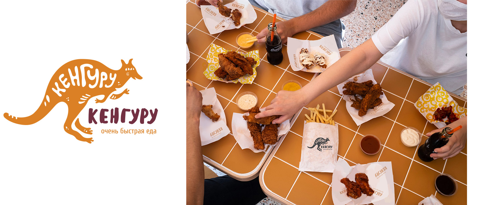
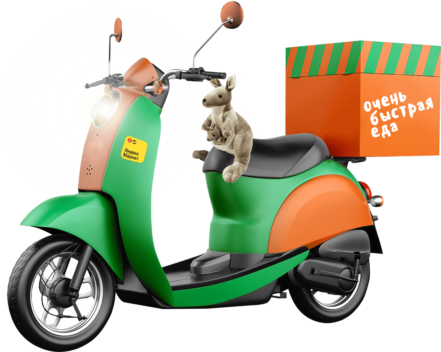
The image of a mother kangaroo – speed and care – was used as a symbol and logo. The logo was designed in the style of a hand-drawn design, slightly reminiscent of a child or youth image. The use of playful fonts and patterns made the products unique and memorable. The warm, bright color (orange) was used intentionally to increase appetite.

In addition to product packaging design, we have developed a brand book containing the entire set of branding elements: from various logo options to choosing the most suitable pattern or its elements.

I want a cool project
Working with smart people is a pleasure. The taste is amazing. The quality of the product is impressive. I recommend.
.png&w=256&q=75)