.jpg&w=3840&q=75)
ABOUT THE CLIENT
The Gushcha Pushcha space is a private family cafe inspired by nature and local food culture. The cafe combines the coziness of a modern urban space with the aesthetics of natural solitude.
TASKS
Update the company's visual style, emphasizing its international status and technological advancement. Create a memorable design code with an emphasis on the masculine and premium character of the brand.
SOLUTION
1 / Conduct a brand analysis and identify its archetype.
2 / Conduct an analysis of the target audience. Identify its needs, fears and tone of voice.
3 / Develop a logo and basic corporate style.
4 / Design of the entrance group, printed and other visual identity materials.
5 / Consultation on the design of the premises for the final selection of objects reflecting the concept of the cafe.
.png&w=3840&q=75)
.jpg&w=3840&q=75)
.png&w=3840&q=75)
Brand analysis. Archetype
Magician, Wizard
The Magician transforms, changes and updates the environment for the better, without speeding up events and without affecting himself. The association of a magician is ingenuity, he interprets familiar dishes, adding a pinch of magic to them.
- Magic brands help change and contain “magical” moments - sensations that seem special and new.
- The product gives a feeling of being transported to another reality and an unexpectedly simple solution to problems.
- The potential of a magician is directed either into innovation or into traditions and rituals.
Analysis of the target audience. Psychotype
Aesthetes, Idealists
Aesthetes are people of a subtle nature who value comfort and beauty. It is important for them to build a life around themselves, decorate their home, develop through self-knowledge and spend time with like-minded people.
- Fans of the ideal world, carefully guarding their comfort and tranquility zone.
- Manner of perception: sensuality, intuition.
- The main driving force in choosing for aesthetes is a subtle attitude to beauty.
Conclusions and Solutions
Comfort zone that takes you to a magical forest
Natural colors, handwritten texts, patterns, hand-made stylization are well suited for aesthetes. Something that conveys sensations and feelings. Tactility also plays a huge role.
- Using simple components in design and corporate identity, as the Archetype Magician creates magic out of nothing thanks to unusual ideas.
- Flowing forms, unevenness, abrasions and natural “flaws”.
- Creating a coherent space with its own rhythm and philosophy, when there is no strict order, but everything is in its place.
Logo = Reflection of a small world of a cafe
The Gushcha Pushcha cafe has a strong idea — it is a place inspired by the forest, natural solitude and natural taste. Our task was to pack this state into a visual identity that would speak without words.
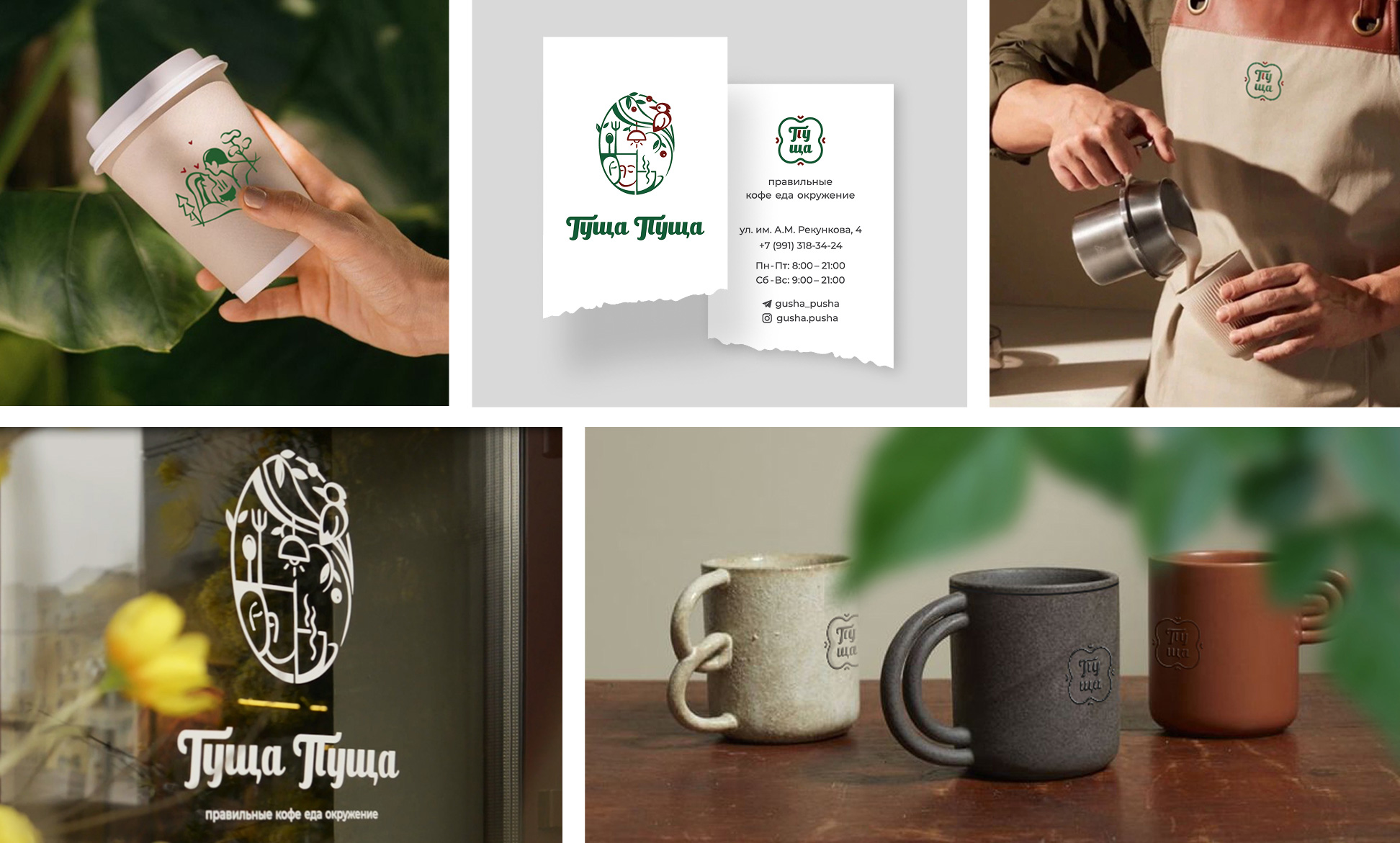
We created a logo with elements flowing into each other, where the image of lovers, the forest spirit, the chirping of birds, the theme of food and even unusual lamps of the cafe are read. The font is intentionally soft, with the effect of handwriting, to preserve authenticity and warm human emotionality.

Visual identity
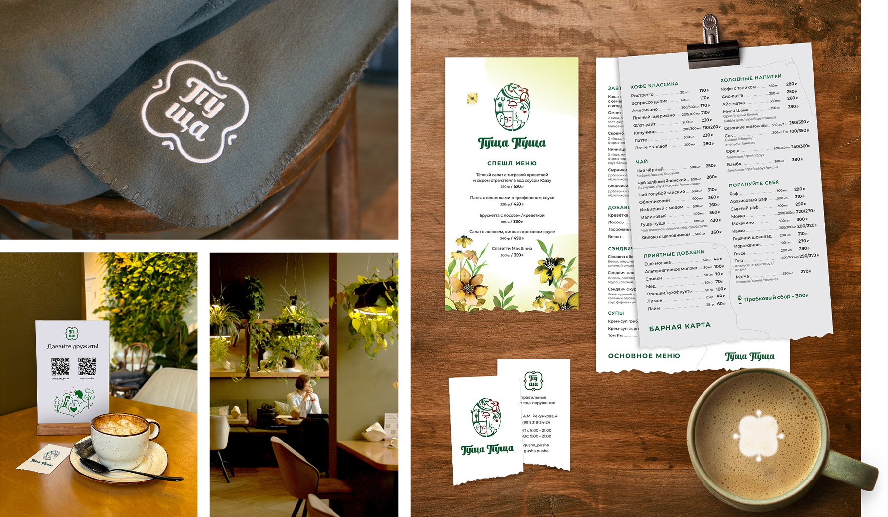
The palette of the corporate style is built on natural shades — wood, green, beige, terracotta. Everything is as muted and cozy as possible, tactilely pleasant materials. We also added illustrations with elements of flora and uneven cuts to connect printed materials with space.

Entrance group
The facade sign continues the theme of the "forest" and creates a soft contrast against the backdrop of urban architecture. We combined the uneven curve of the tree and a white contrasting insert. The space in front of the entrance is designed as a frame of a forest glade: warm tones, dried flowers, bamboo elements. All this is not just decor, but immersion in the atmosphere of the brand from the very beginning.
This cafe is not about rushing - it is about breathing, rhythm and harmony.
Corporate style
The menu is assembled from separate sheets of different colors, which affects its budget edition and reminds of natural wealth, like an autumn forest.
The fonts are as simple as possible; the materials are tactilely pleasant and dense.
Business cards with a "torn" edge as a menu and facade sign. In making the space, we carefully adapted the logo and elements of the corporate style for application to glass surfaces and textiles: aprons, pillows, blankets. Preference was also given to natural textures and tactile materials.


The Gushcha Pushcha space is not just a café. It is a story told through smell, taste and visual code. We are proud to have become part of this botanical fairy tale and helped make it recognizable.
I want a cool project
Our beloved Raccoons! I think we've known each other all our lives, and the most beautiful thing about it was invented and created by the R-Band! The guys approach each new project with such creativity and depth, creating each time a new unusual universe in which they want to settle. Incredible professionalism, the desire to understand all the needs and wishes of the customer. As a result-to present an unusual, stylish and admiring solution! Starting any business, brand, creating an English To Go website, opening the Guschka-Pushcha coffee shop, the most beautiful logo of my personal Coach brand... all only with the R-Band guys. Many thanks and a bow to Victoria, Daria, Andrey, and the whole team! Working with R-Band is always a pleasure and definitely with a result that exceeds all expectations! I strongly recommend and advise! Our friends from Europe were very pleased with the logo and brand book created for their new international clinic! R-Band is about extreme professionalism, style, innovation and sincerity!
.jpg&w=1080&q=75)
.png&w=1080&q=75)
.jpg&w=1080&q=75)
.png&w=1080&q=75)
.jpg&w=256&q=75)