(1).jpg&w=3840&q=75)
Task 1. I want it to be cool so that I squeal"
It was with these words that Karina came to us to develop a logo for her brow bar. The customer had no idea about the future corporate style. The main wish is to move away from using the usual attributes of eyebrows (eyes, brushes, brushes).
Also important to the customer was the issue of natural female beauty and its natural maintenance. Therefore, in addition to proper coloring, you can purchase natural eyebrow products in the salon and attend master classes on home care.
Task 2. Formation of style
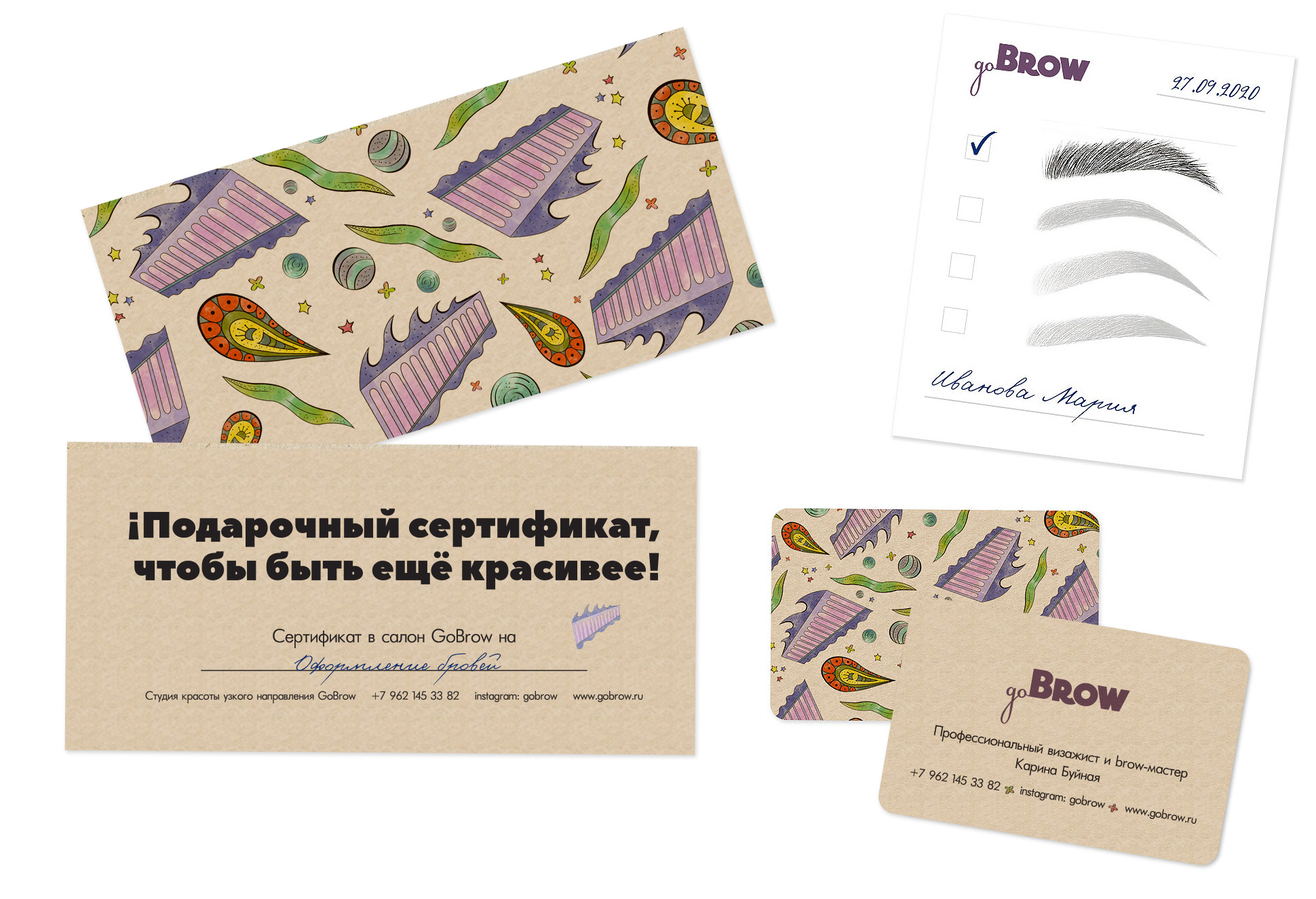
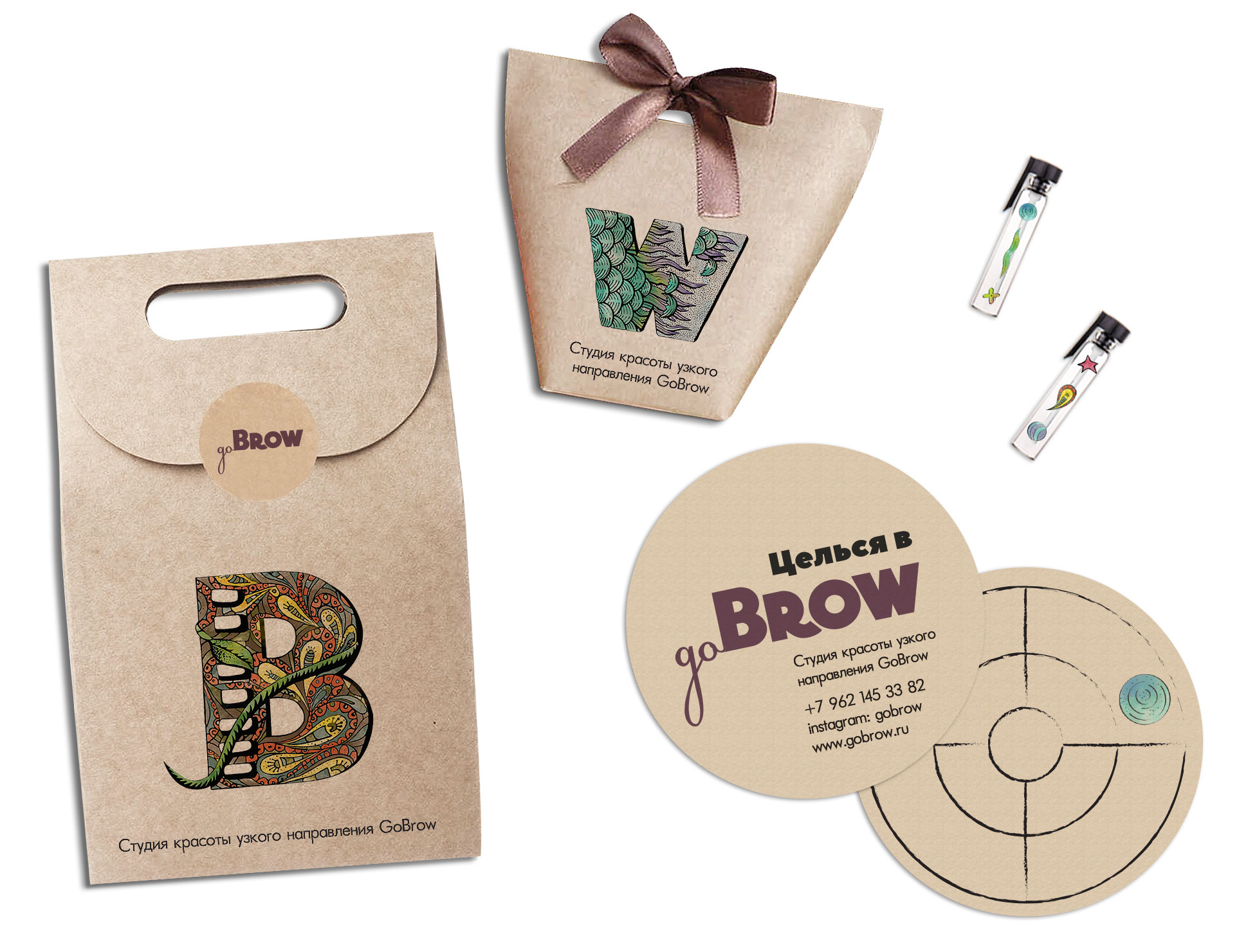
Based on the image of Nature, we created a corporate identity that reflects the natural elements. The first letter "B" symbolizes flora, "R" - sky, "O" - earth, "W" - water.
Thanks to the complex type, the logo can be decomposed into independent elements. This makes it easier to create patterns and design branded products. For oil samples, we have developed a set of stickers that allow you to distinguish them from each other by composition and purpose.
Task 3. Play on words and forms
To establish emotional contact with the client, non-standard phrases were used on branded products. For example, the accumulative discount card “Aim at GoBrow” was created by analogy with the phraseological unit “Not at the eyebrow, but at the eye.” It is made in the form of a target into which stickers for visiting the salon are accumulated.
I want a cool project
Logo, corporate identity and promotional materials of the Go Brow salon, Russia
Vika made the COOLEST logo for me! A true master of his craft!! With me it was difficult, staggered from one idea to another but!! the final result is very pleased! Vika, thank you very much. Creative success and adequate customers!
.jpg&w=256&q=75)
(1).jpg&w=1080&q=75)