(1).png&w=3840&q=75)
Task:
Create a non-standard logo and branding that carries the natural symbolism of the event and responds to the young target audience for whom this Festival is held. Branding should reflect the idea of the event, but without being overloaded. I wanted purity, lightness and simplicity when applied to various printing media.

Solution:
Together with the customers, we identified several main problems that the project raises:
- informing young people about the importance of creating and preserving natural areas;
- studying the history of the region;
- involvement in environmental issues;
- creation of an interactive map with forest tourist routes;
- formation of the urban environment.
Graphic metaphors were selected for these theses, which we compiled into one sign. Bryansk Komar was chosen as one of the honorary symbols of the logo. In the process of work, we developed about 20 combination options until we found the right option.
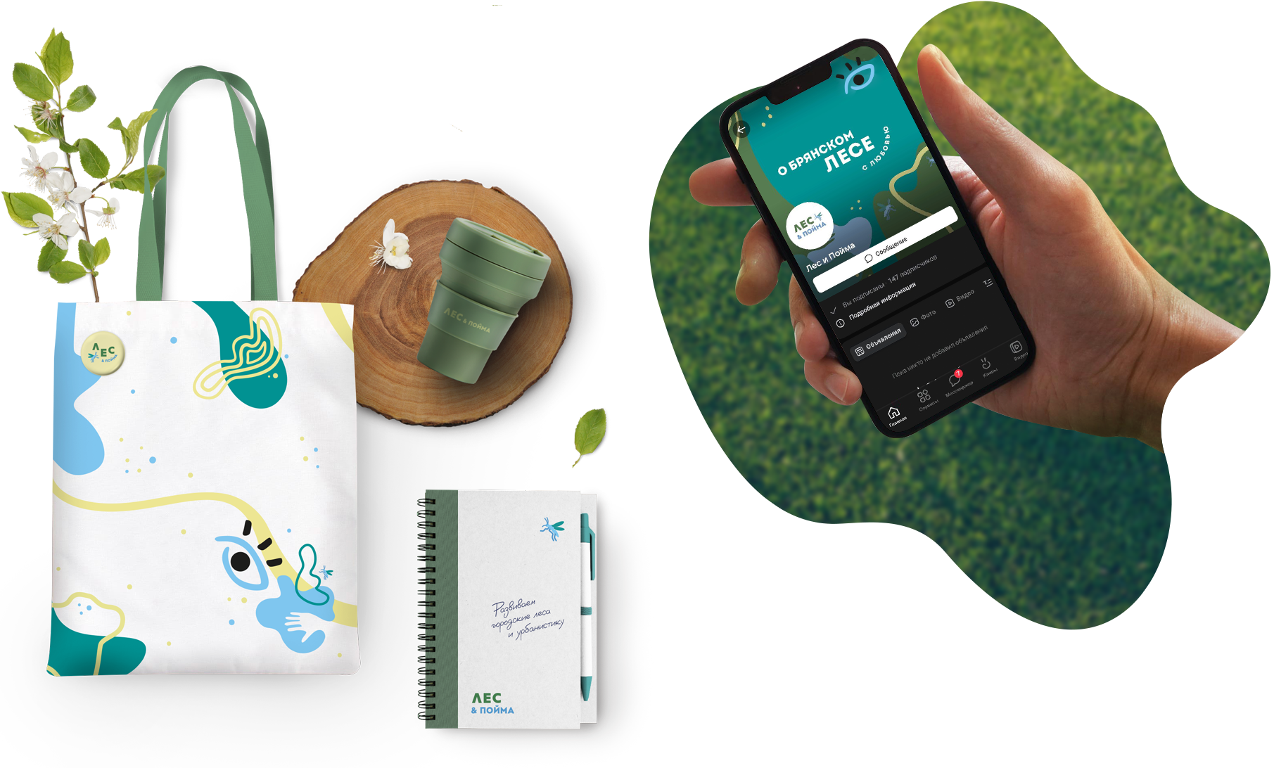
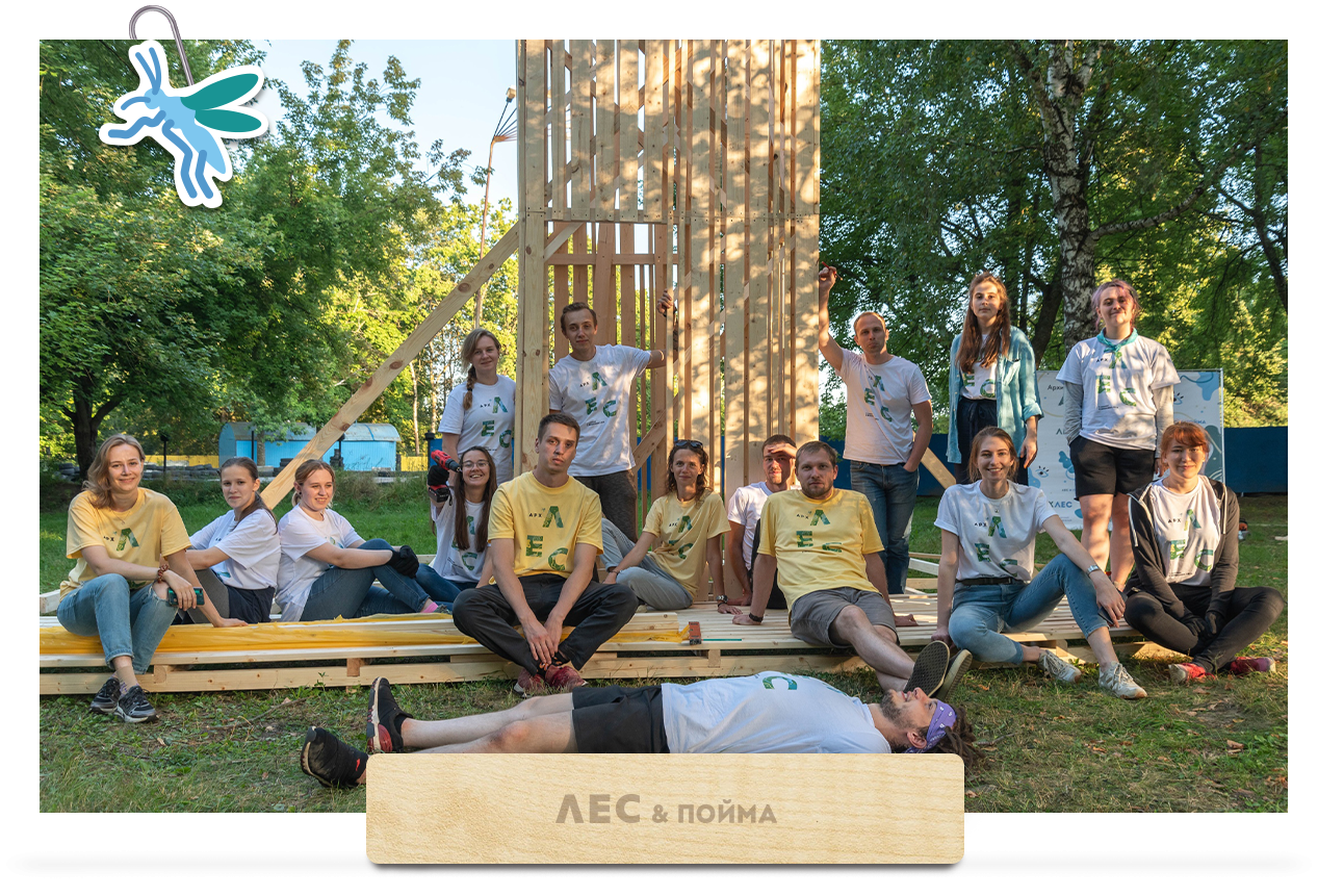
In addition to the logo, stylish merch and social media packaging were developed. Each Festival participant received a branded shopper and a T-shirt.
RBand also developed a limitless corporate pattern and a collection of individual elements for the independent work of the Festival curators.
I want a cool project
Logo and branded products of the state project "Forest and Floodplain", Russia
Our project is about Bryansk and for Bryansk, it was important for us to find local designers, as they know the city better and we were lucky to find RBand., The guys immediately managed to read our thoughts, so we got cool merch, T-shirts and other printing.Thank you for your productive work and our mosquito!
(1).jpg&w=1080&q=75)