.jpg&w=3840&q=75)

DEKADO company is one of the leading Russian manufacturers of gas and electric tools for forestry, agriculture, gardening and construction.
Pain 1: the Chinese always confuse everything
Since the product and packaging are produced outside of Russia, difficulties and confusion arose in the manufacturing process. The customer could never understand what color the equipment would arrive and how else they would “make fun” of the logo.
Solution:
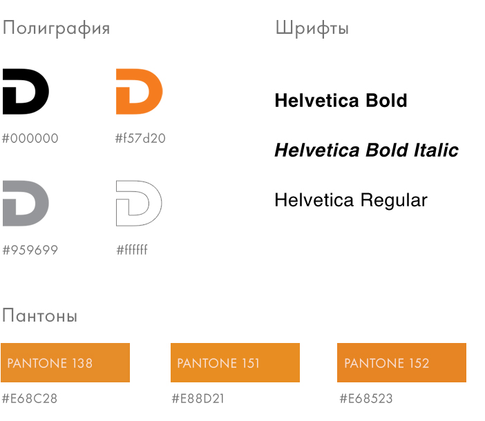
The architecture of the font has been redesigned in detail (in the old version there were different line widths, distortion of elements, and incorrect letter spacing). We have also developed a series of additional logos. The rules for using different variations of the sign depending on the color, proportions and size of the application surface have been thought out.

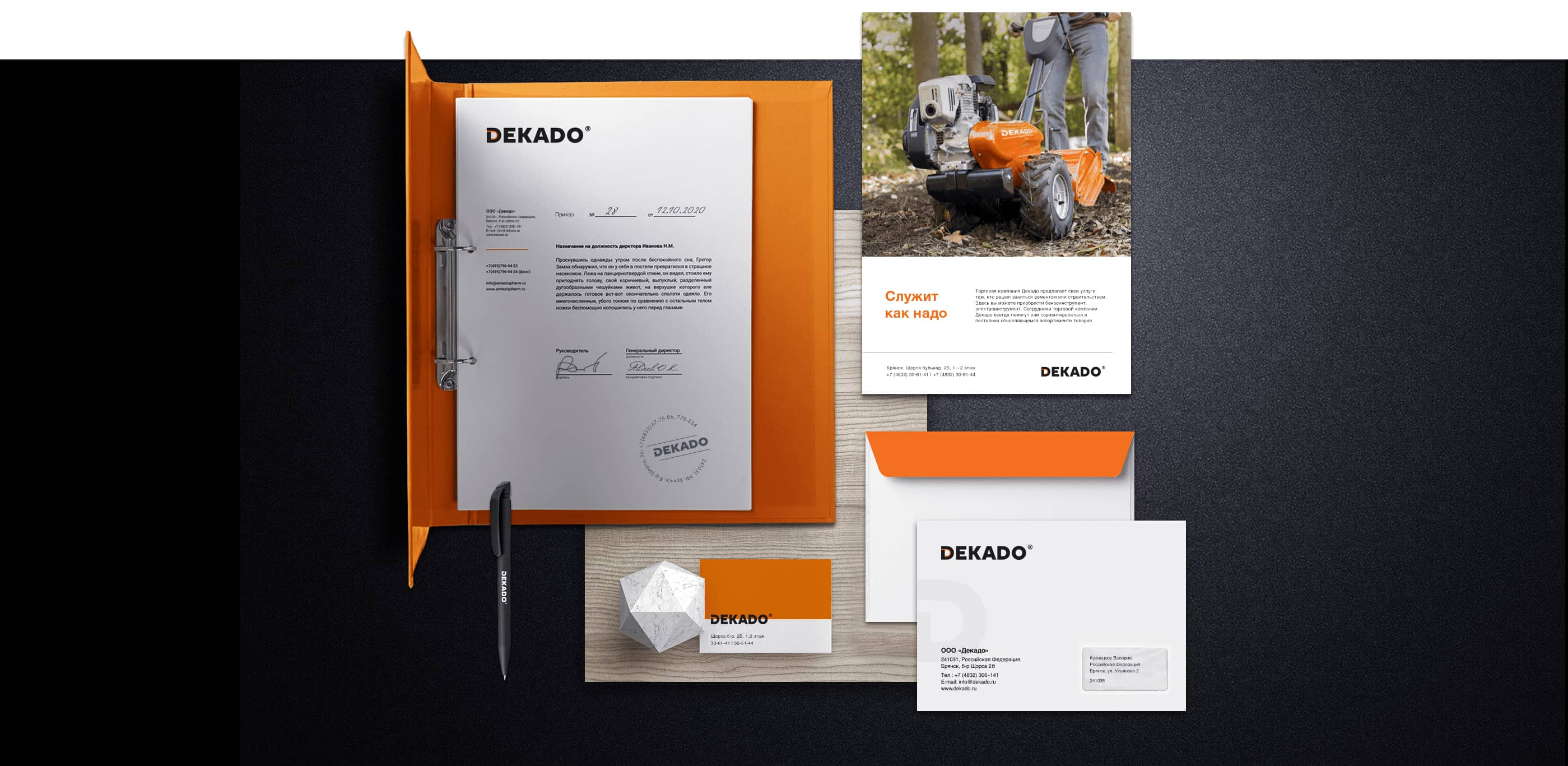
Pain 2. there is no uniform style of printed materials
Due to the lack of a unified corporate style of the brand, each new designer developed materials at his own discretion
Solution:
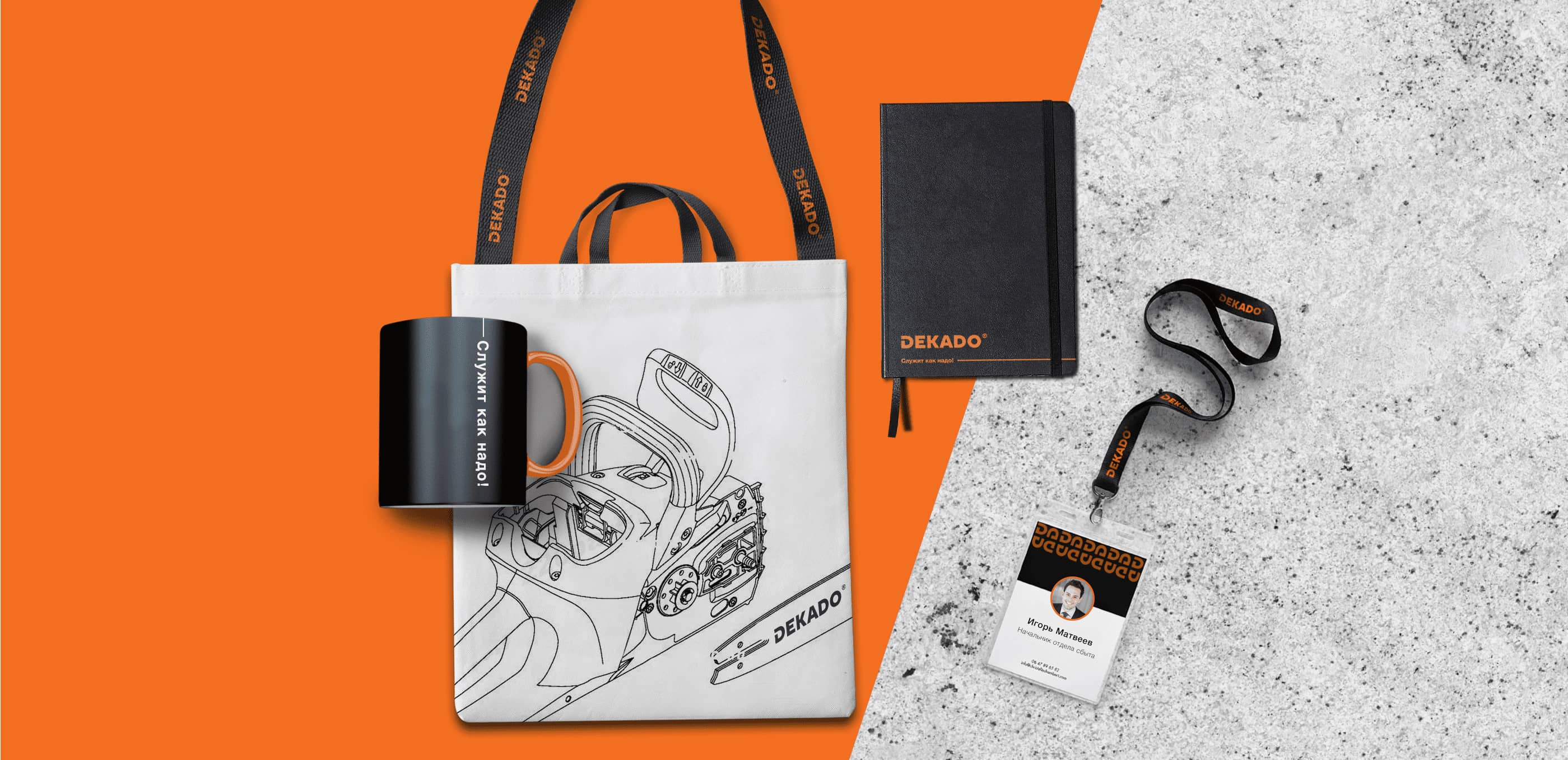
We have developed a guideline with rules for using a corporate identity, which describes all possible options for using a logo, slogan, pattern, corporate fonts and colors. The guideline was written in Russian and English. We have also developed a line of printing and gift products.
Pain 3: how to simply convey complex things?
Complex technical information was poorly structured and presented. Because of this, it was difficult for buyers and sellers to study the characteristics of the product. The consumer will quickly put down the Dekado box and prefer another manufacturer that is more understandable.
Solution:
All technical information was structured according to meaning, accents were placed, a font set was selected, tables and tabulated lists were stylized.

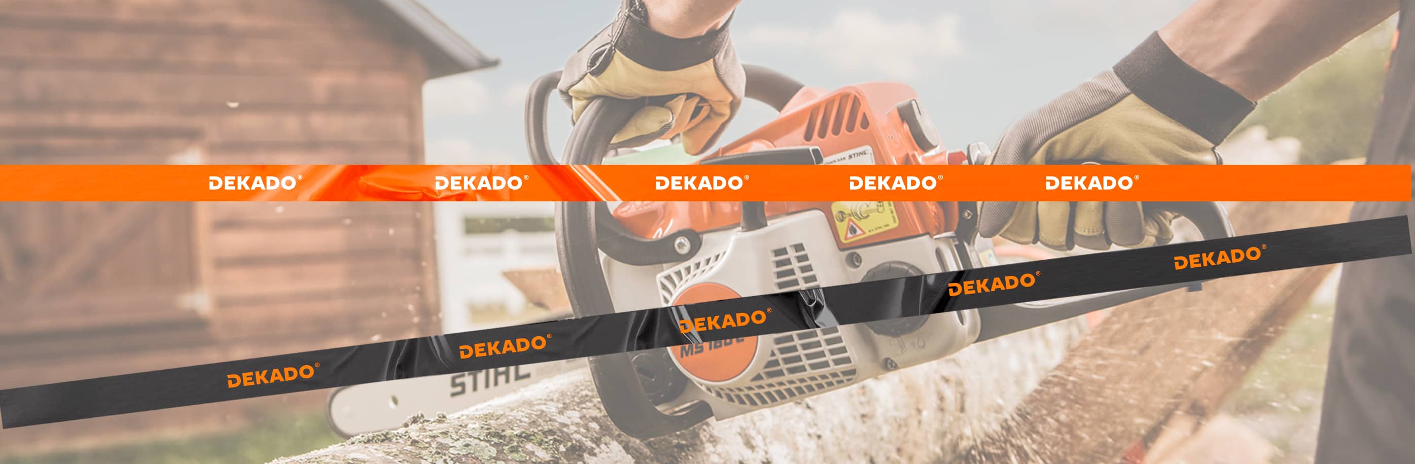
Pain 4: each time the color of the product is different
Taking advantage of complete freedom and the absence of rules, the contractor often used paint that did not match the corporate style in order to save money on purchasing a suitable pantone.
Solution:
Thanks to the line of pantones prescribed by us, the manufacturer undertakes to produce goods exclusively from existing options.
Thanks for watching
I want a cool project
Restyling of the logo, design of branded products and development of the product design guideline of the brand "Dekado", Russia
Thank you for designing the Dekado logo and guiding us to use it. Our products now look much better. Cooperation with manufacturers has become much easier. Your talent has served us well and we will not stop recommending your agency to our business partners.
.jpg&w=1080&q=75)