.jpg&w=3840&q=75)
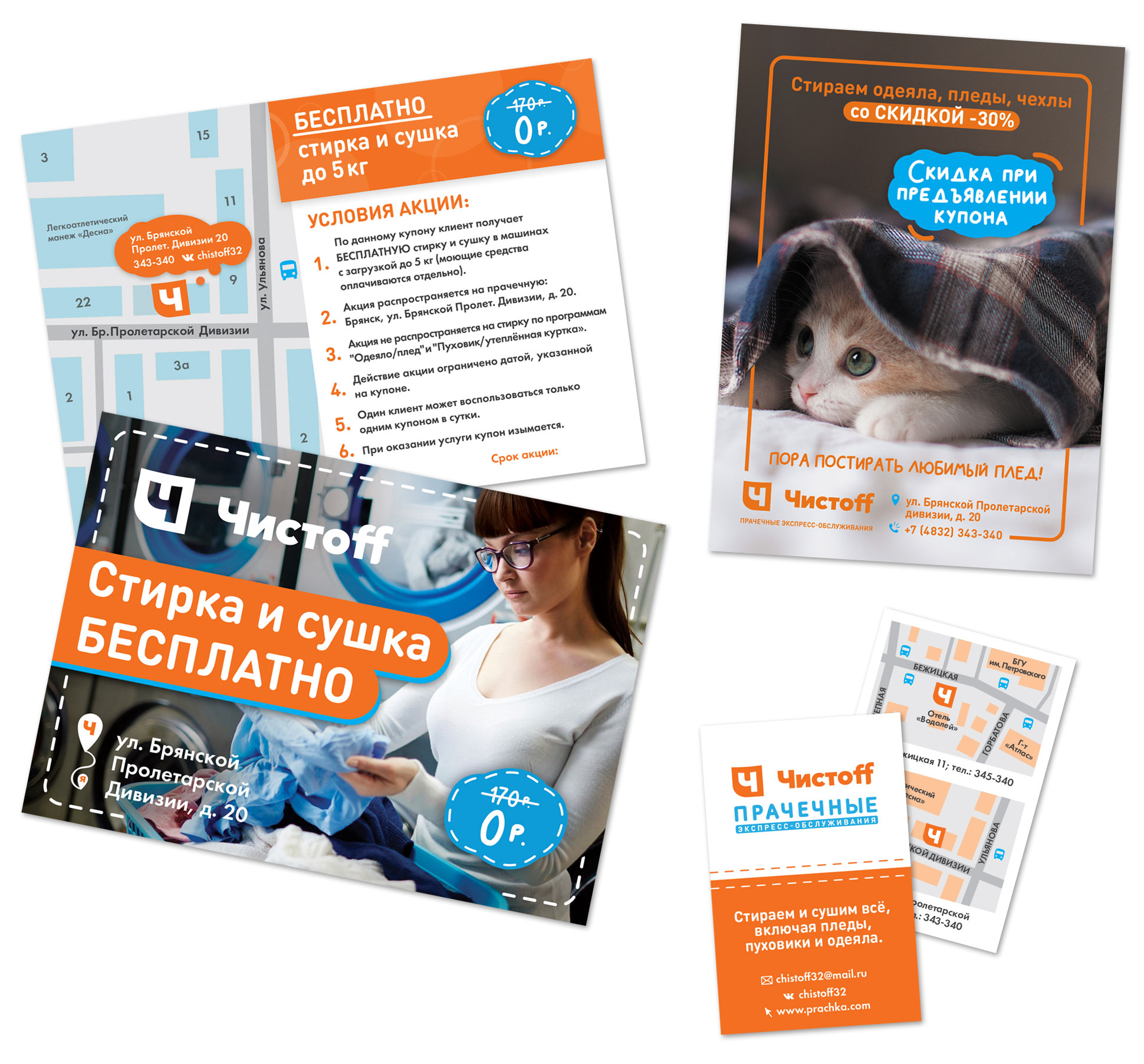
"Chistoff" is a new project of chain self-service laundries throughout Russia. Our task was to develop a corporate identity and printed materials for the opening and permanent promotions of two points in Bryansk.

Task 1. Within the framework of the general style
Since the company in Bryansk was opening as a franchise, we had to work with a developed basic corporate identity: logo, colors and fonts. There was nothing else.
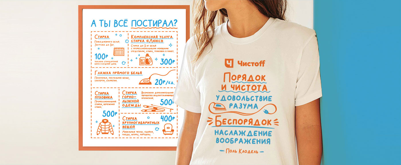
The main symbol of proper washing is a label on the clothing indicating at what temperature the item can be washed. We used similar iconography in the company’s corporate style. Photos of freshly washed laundry and satisfied people were chosen for flyers and brochures to convey the pleasant feeling of clean things. The decorative element of the materials is a dotted line, reminiscent of a garment seam.

Task 2. Determine “For whom?” in order to understand “How?”
To create a high-quality design, it was necessary to identify the target audience. The main clients of self-service laundries are:
- Students living in dormitories and renters who do not have a washing machine.
- Modern middle-aged people who do not want to waste time on household chores.
- People who from time to time need to wash large items that do not fit in a household washing machine (suitcases, sleeping bags, tents).
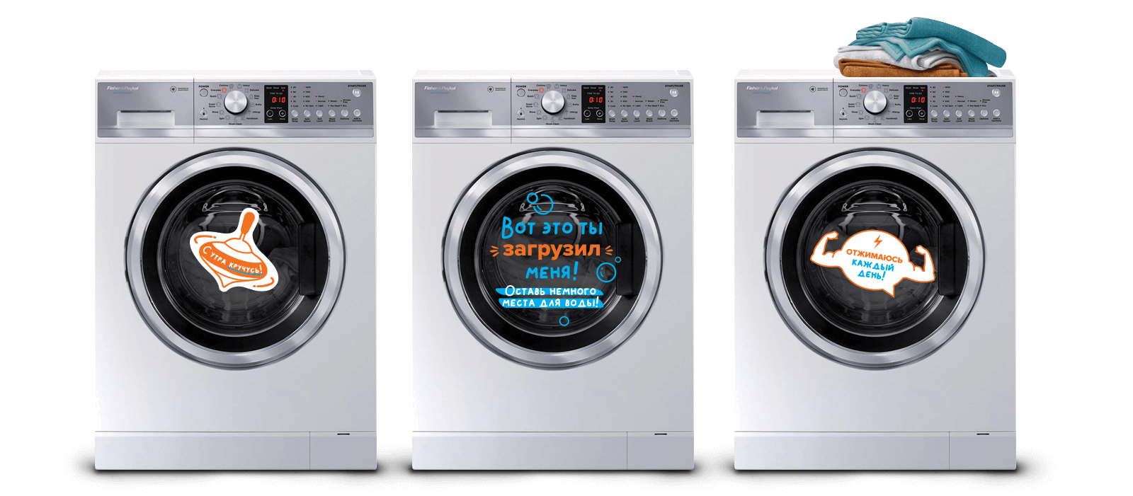
Based on the buyer's profile, a modern, bright design was chosen and contrasting headlines and humorous phrases were used in all products.

I want a cool project
I very rarely recommend anyone. And it's not that I'm sorry to share my good contacts, but because everyone has their own criteria for evaluating partners and suppliers. What I liked is far from the fact that everyone else likes it. So I can confidently recommend R-Band to most of my friends and not only. This is a team of professionals who intuitively understand what you need. And, what surprised me a lot, unlike other specialists in creative professions, R-Band has everything exactly on schedule and on time. For the past year and a half, we have been constantly turning to them for the development of printing products and the design of our advertising activities.
.jpg&w=1080&q=75)
.png&w=256&q=75)