(1).jpg&w=3840&q=75)
Task
Comprehensive development of corporate identity and basic POS materials. Creating a homely, slightly festive atmosphere in printed materials and interior design. The Banoffee logo reflects the signature dessert of the same name, as well as the atmosphere of a cozy Italian pizzeria.

How the logo was developed
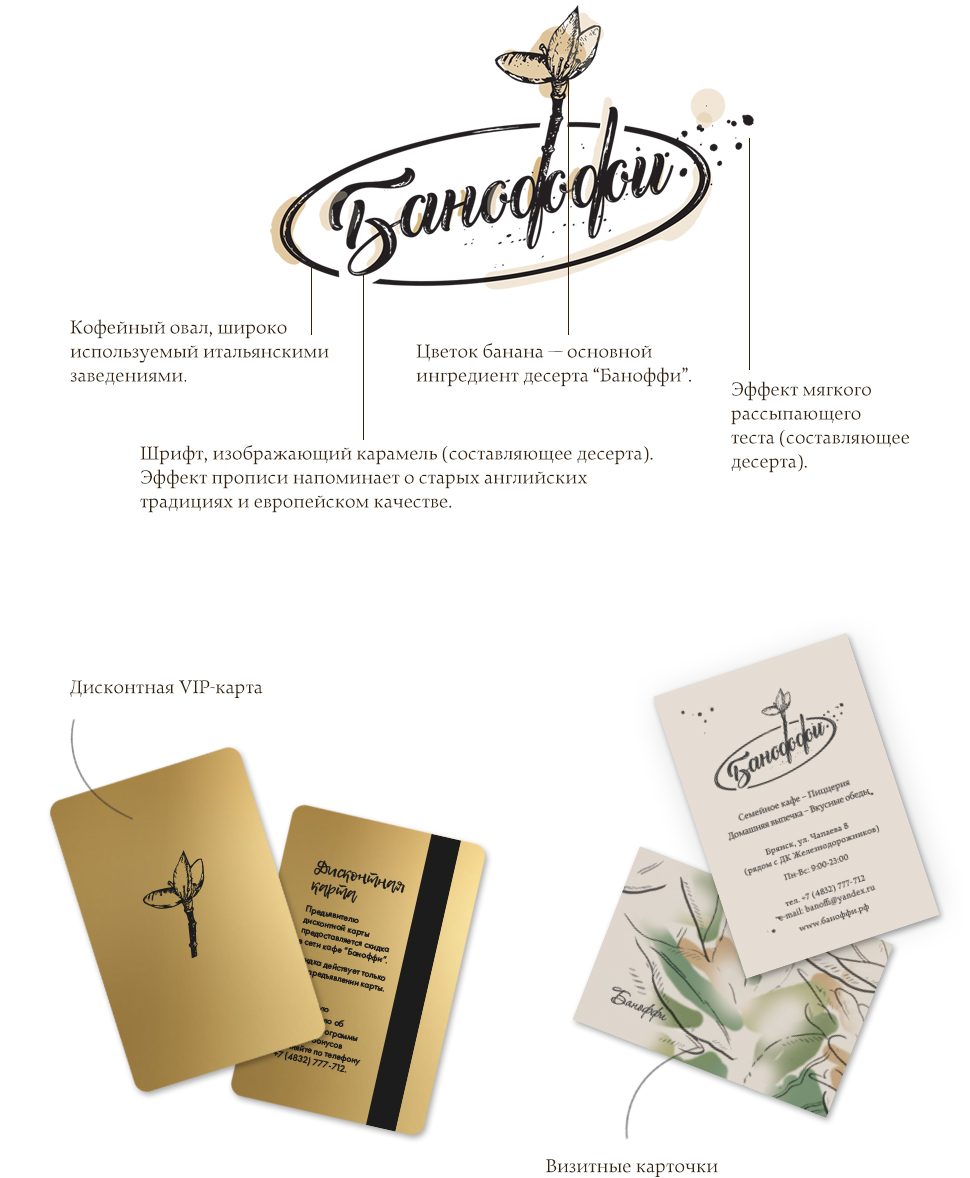
If you look closely at the logo, you will find the following elements and features: a “fluid” font reminiscent of caramel, a banana tree flower, and the right side of the logo that crumbles like shortbread. All these are the three main components of the signature English dessert “Banoffee”. An oval was also added, which is widely used by Italian establishments, since the main focus of the menu is Italian cuisine.


Interior Design
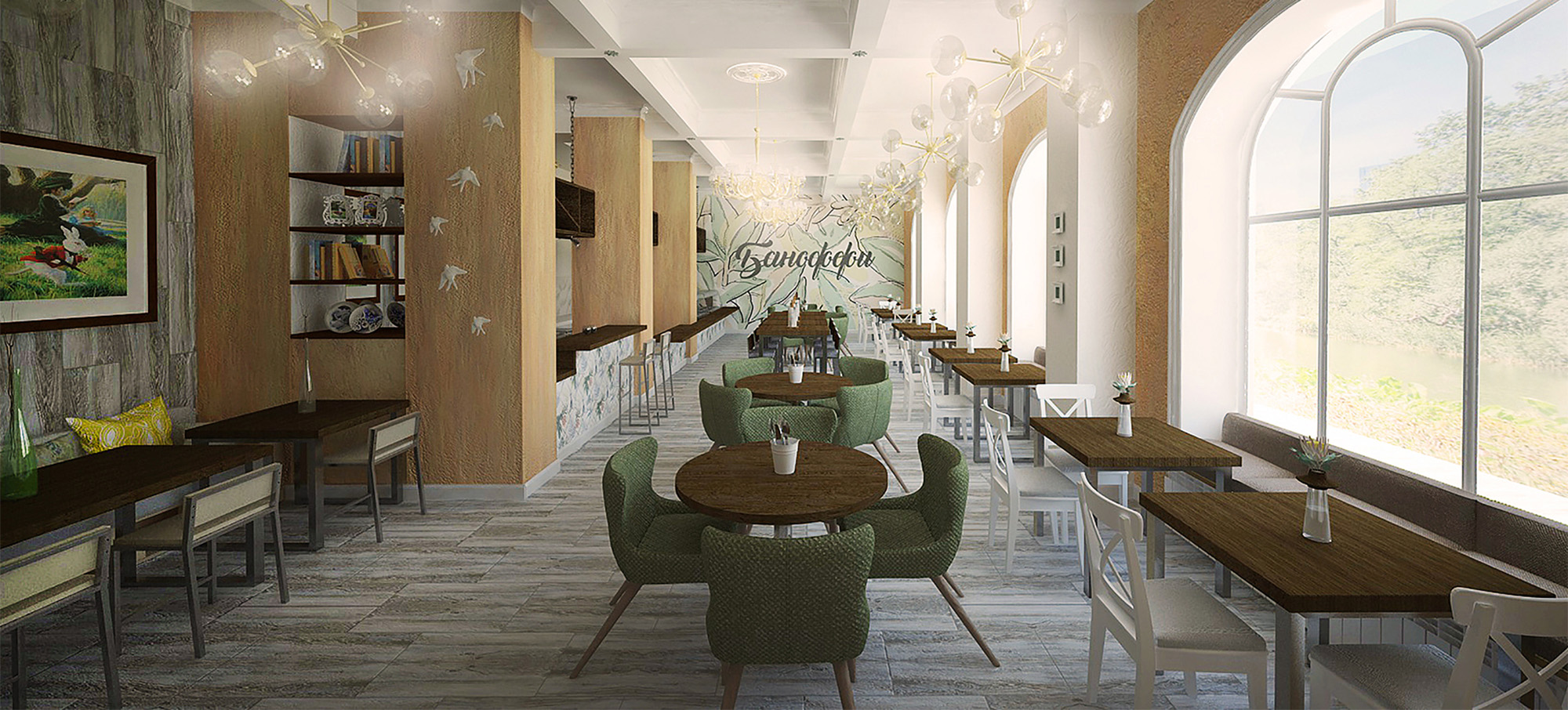
Mood: affordable family cafe of European level. Festive atmosphere, delicious food, special attitude towards children and families.
Colors: peach, muted green, brown and beige.
About the progress of work
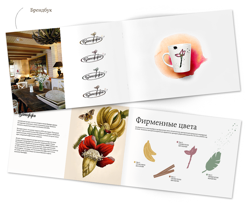
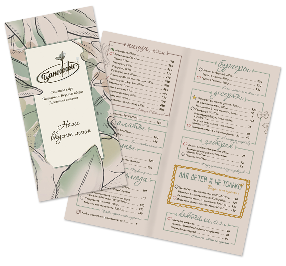
To start , a main logo, a series of secondary logos, a series of additional graphic elements, a brand book with selected fonts, colors, and rules for using the logo, as well as business and discount cards, three types of menus, hangers and a wall calendar were developed.

-px.jpg)
I want a cool project
Guys, thanks for the work! You are professionals with a capital P! It all started with the interior design of the Banoffee cafe, then it was simply impossible to stop. you developed the perfect corporate identity for us, created a website that fully meets all our needs)) It’s easy, pleasant and understandable with you!!! You are best!!! In general, if you want it to turn out great, go to RBand!!!
(1).jpg&w=1080&q=75)