(2).jpg&w=3840&q=75)
Task:
Redesign the logo, make it more universal and modern. Demonstrate that the company does not stand still and is constantly developing, despite many years of experience.
Solution:
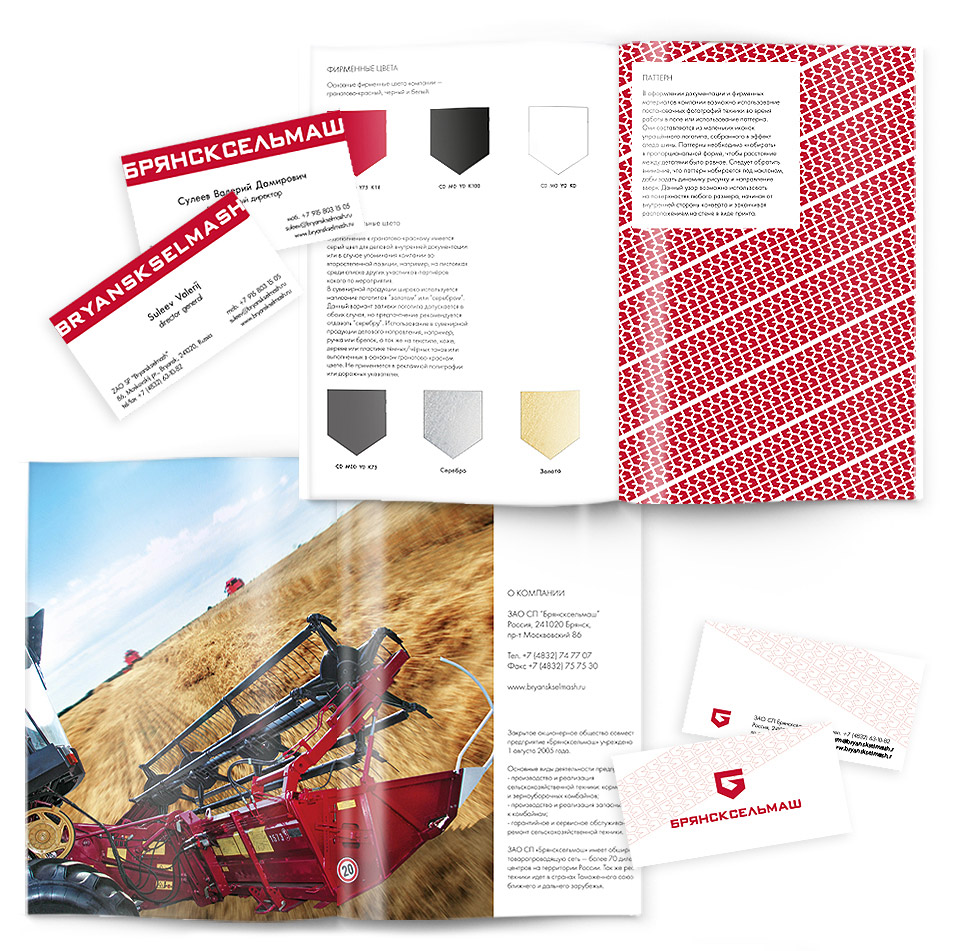
The main logo consists of a sign and the inscription of the company name, written in a specially selected thick font. The sign is a stylized image of the letter “B”, a shield symbol and a diagram arrow pointing to the upper right corner.
The company’s expertise is reflected through the “News” section, which publishes articles related to the professional activities of the company, as well as its awards and achievements.
The only way to keep the state in a state of independence from anyone is agriculture.
Jean Jacques Rousseau
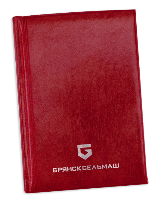
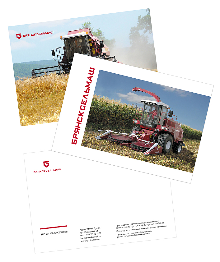
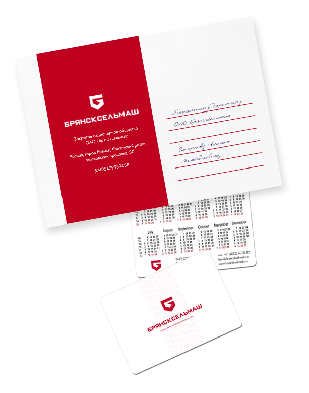
The main corporate colors are garnet red, black and white. In addition, there is a gray color for business internal documentation and in case the company is mentioned in a secondary position, for example, in leaflets among the list of other participating participants of an event.
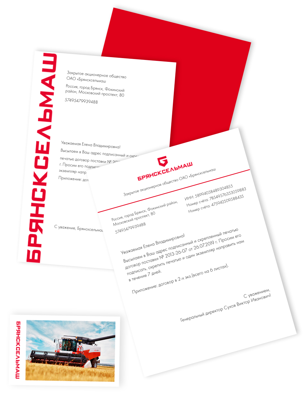
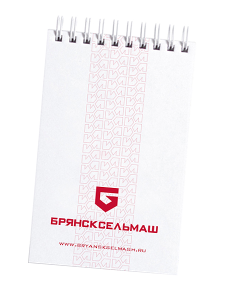
In the design of documentation and company-branded materials, it is possible to use staged photographs of equipment while working in the field or use a pattern. They are made up of small icons of a simplified logo, assembled into a tire track effect. Patterns must be “typed” in proportional form so that the distance between the parts is equal. This pattern can be used on surfaces of any size, from the inside of an envelope to being placed on the wall as a print.
(1).png&w=3840&q=75)

(1).png&w=3840&q=75)
Brand Analysis. Archetype
Ruler (Worker)
The Ruler archetype seeks to prevent chaos by taking full control. This archetype sees itself as a role model for others and strives to help them achieve prosperity and security.
- Mission: to promote a high standard of living through smart business development and its components.
- Goal: to create a prosperous and successful kingdom, control it, and improve it.
- Talents: responsibility and leadership.
Target Audience Analysis. Psychotype
Independents with elements of Traditionalists
Independents are successful people who have built themselves or are on their way to doing so. They have their own perspective on events. From traditionalists, this audience adopts patriotism, love for rural business, and family values.
- Communication is built on the brand’s status. The advertisement design is minimalist. Unnecessary noise is not welcomed.
- Ad placement is carefully selected: business magazines, business-related websites, billboards, conferences, exhibitions.
Conclusions and Solutions
Bold yet concise image with a masculine character
To combine "luxurious brutality" and traditionalism, we focused on the corporate red color, complementing it with gray and white. We also added geometric shapes reminiscent of blueprints or electronic schematics in the field of mechanical and engineering industries.
- Using high-quality and durable materials for branded products.
- Incorporating the logo or its elements into product design to enhance brand recognition.
(1).png&w=1080&q=75)

(1).png&w=1080&q=75)
I want a cool project
Bryanskselmash plant rebranding, Russia
I would like to express my gratitude to Victoria for developing a brandbook for CJSC JV Bryanskselmash. The entire package of corporate identity elements was executed very competently and creatively, which helped us to refresh all marketing communications of the company. Special thanks for your understanding, patience, and ability to take into account our wishes and make changes quickly! Vika, WELL DONE, keep it up!!!
.jpg&w=256&q=75)
.jpg&w=1080&q=75)