.jpg&w=3840&q=75)
When interacting with the interface, users should immediately understand which elements are clickable and which are not. The more effort it takes for users to understand the interface, the less user-friendly it is for them.
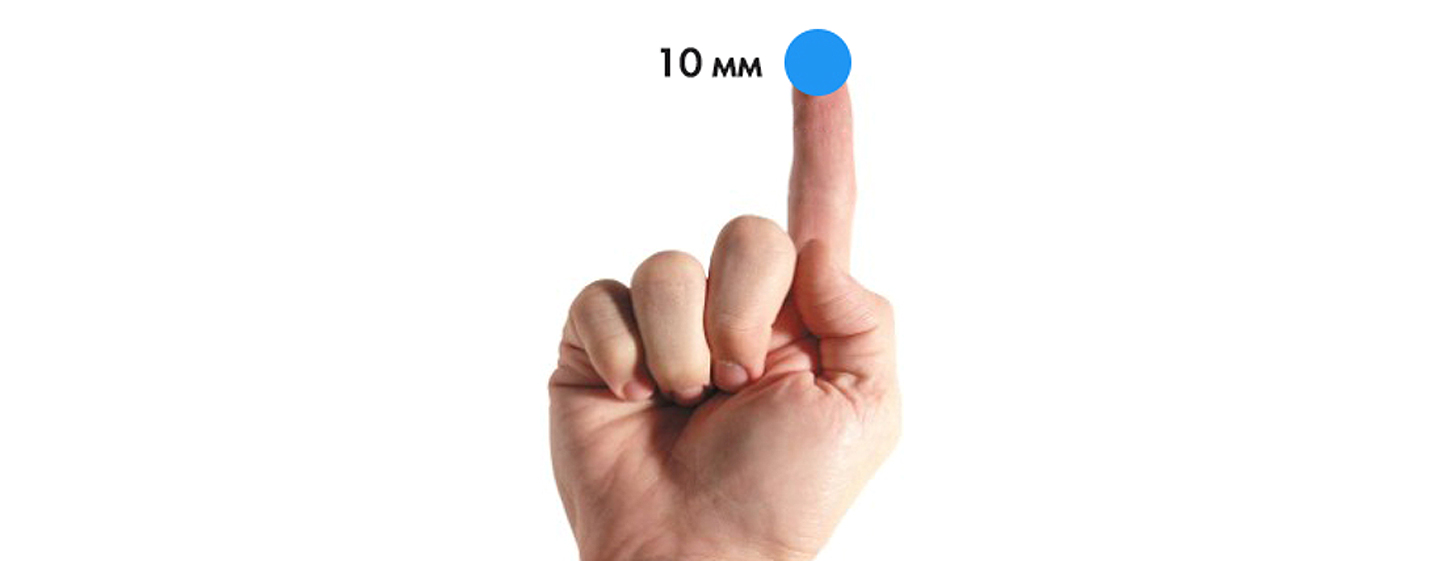
When creating buttons for mobile applications, you need to consider the size of the touch zone. According to a study by MIT Touch Lab (IT laboratory, USA), the optimal size of the touch zone will be 10x10 mm.
Don't play "find the button" game with the user
The order of the buttons is important, especially if there are paired buttons. For example, how to arrange the Back/Forward buttons? Logically, the button that moves you forward should be on the right, and the button that moves you backward should be on the left.
It's important to place buttons where people expect to see them!
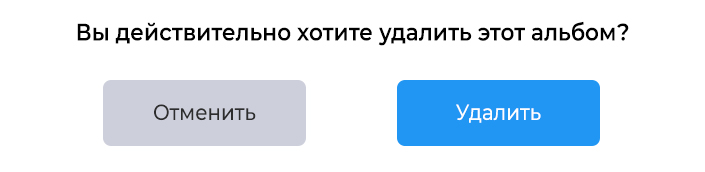
Focus on the most important action
In the example below, the main action is highlighted in color and is also located on the right side of the window, close to the thumb of the right hand, which minimizes the time for pressing the button.
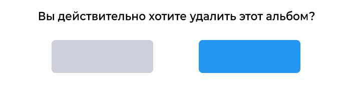
Buttons should say what will happen when pressed.
Exactly the same buttons as above, but without the corresponding inscription. Do you feel the difference?
Button shape
When creating buttons, you can use various shapes, even some original and unusual ones (although you should be careful with the last option).
The main thing is to maintain the unity of style throughout the site.
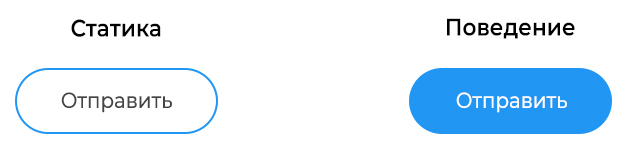
Button priority
The main action button should be made more visible by increasing its size or using a contrasting color.
Take care of order
The order of digging should reflect the conversation between the user and the system. When designing an interface, think in advance what actions the user will want to see on the screen.
Don't forget to answer
When a user clicks a button, he expects to receive a response confirming the interaction. When a button does not provide feedback, the user thinks that the system did not receive the command and repeats the action.
For some operations (for example, downloading), you should not only give an answer, but also show the current state of the process.
Button types and behavior
Volumetric button
With a flat website design, it is advisable to add visual effects for buttons in a static state. In this example, when you hover/click the button, the shadow disappears and it becomes darker.
Flat buttons
The main advantage of flat buttons is that they do not distract attention from the content. And can be used as secondary.
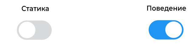
Switch button
This button allows you to switch between two states. Almost all switches are used as On/Off buttons.
Radio buttons can also be used to group together items that are related to each other. But the layout must clearly indicate that these buttons are part of an entire group of elements.
Icons are best used when the user can make a selection and deselect it, there are no other options. For example, give or remove a star from a product. Apple uses toggles in the Settings section.
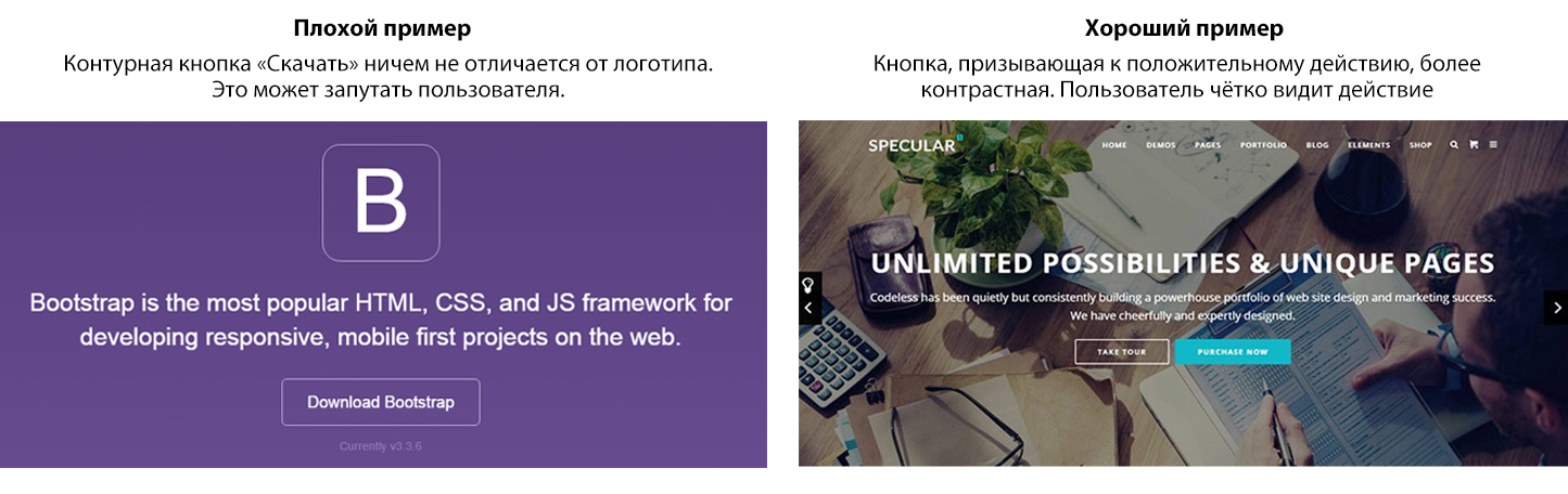
Outline buttons
These are transparent buttons of a simple shape. Usually there is a very thin line along the outline of the button, and the inside contains plain text. When clicked, the button fills with color
These buttons are best used for secondary content because they won't compete with your primary call-to-action buttons.
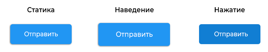
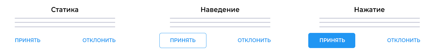
Button states
A button has several states, and the user must clearly understand its current state.
Normal condition
Windows 8 is a prime example of bad button design. It is difficult for the user to understand whether objects in the settings menu are clickable.

State in Focus
The right thing to do is to let the user know that he is hovering over the button. The user immediately understands that their action has been accepted and wants visual confirmation.
Pressed state
By animating different elements of your design, you can add a fresh twist, get a little creative, and delight the user.
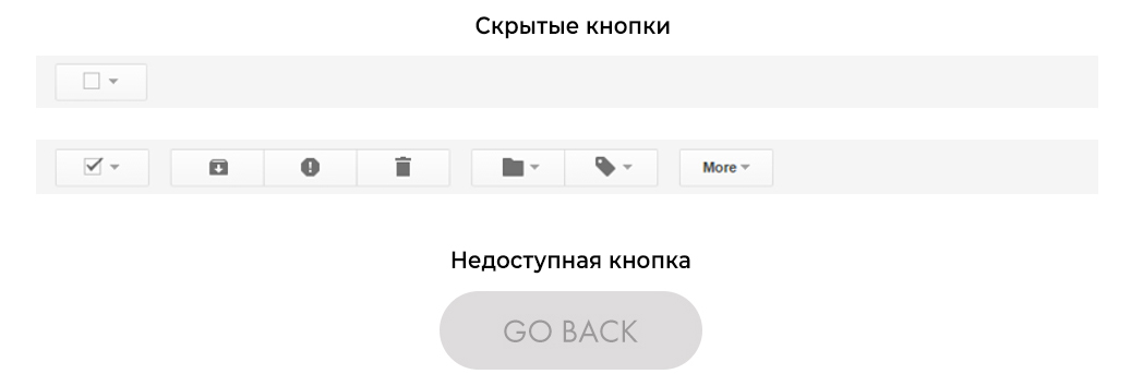
Inactive state
There are two options - hide the button, or display it in an inactive state.
Conclusion
Buttons are designed to guide the user and push him to take the action you are interested in. Therefore, it is worth taking care to make this element of the highest quality possible. Difficulty finding the right button will be a hindrance at best, and a complete failure at worst.
Think of a site or app as a conversation with the user, and buttons as a means of communication. A site without buttons is a monologue, with buttons it is a dialogue. The button plays an important role in this conversation.
