(1).jpg&w=3840&q=75)
Task:
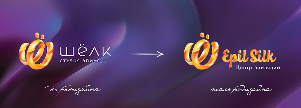
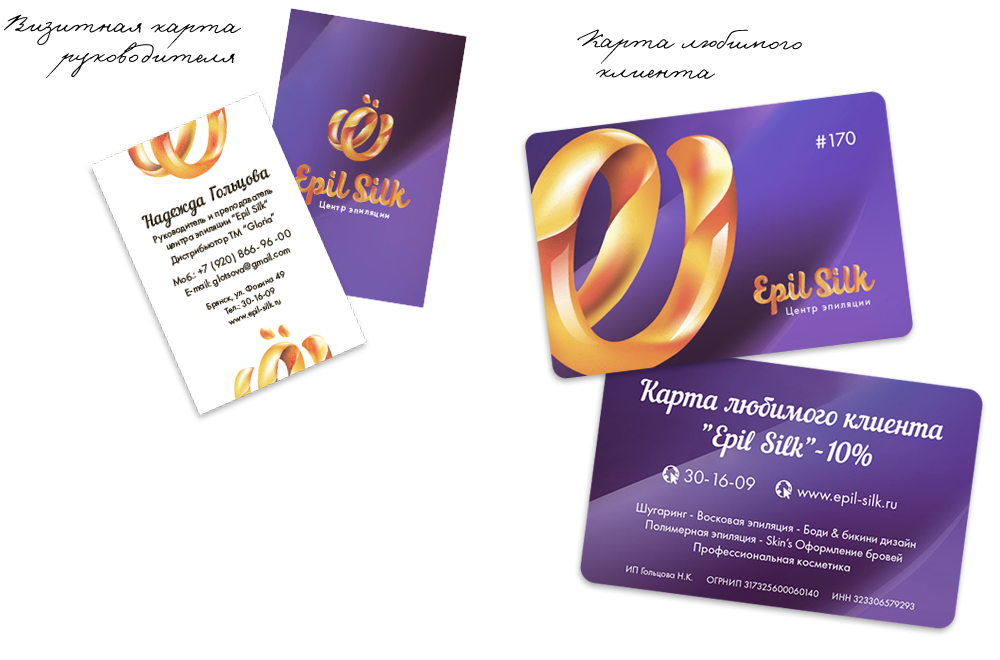
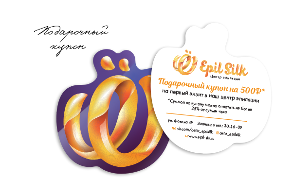
Refinement of the text part of the logo, which could be used as an independent secondary logo without a sign. Development of corporate identity, design of printed and gift products. The main wish of the customer was a competent brand design that would be pleasing to both female and male audiences with different budgets.
Solution:
For the text part, a rounded “fluid” font was selected and refined , reminiscent of melted sugar or wax, which is actively used in the work of the salon and echoes the sign of the existing logo. Now the text and graphic parts can be used independently, and when used in combination, the sign does not look heavier or more significant than the company name.
.jpg)
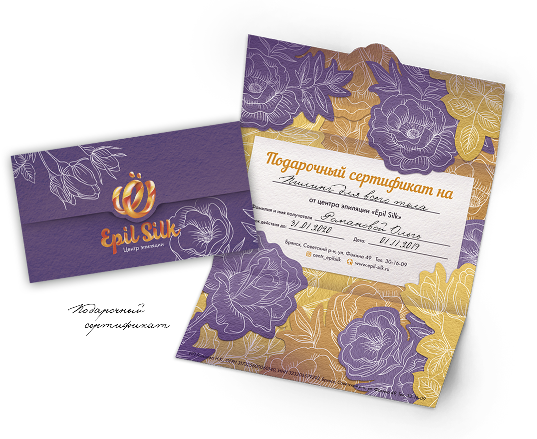
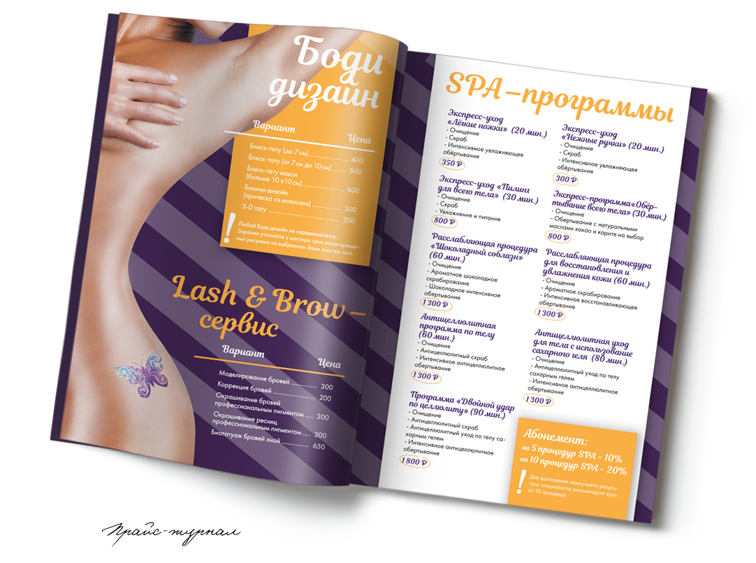
Elements of yellow shades, symbolizing cosmetic pastes and smooth lines reminiscent of the curves of the body, set the general mood and reflect the direction of the company through the entire corporate identity. Also, the contrast effect is actively used in printed products - saturated backgrounds on the one hand and snow-white “sterility” with a strict presentation of information on the other.
.jpg)
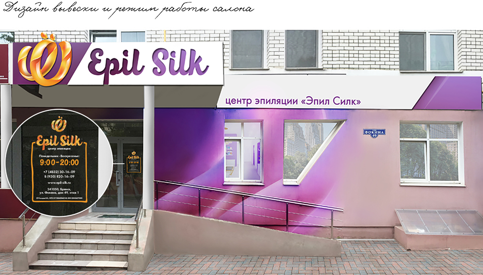
For work, we got a fairly large room, which had to be intelligently divided into a waiting area with a reception, 4 offices and an office for staff. Basically all the walls were painted white or purple since they were all drywall. Each room had one wall with imitation brickwork.
I want a cool project
Corporate identity and design of Epil Silk salon, Russia
You guys are cool! Victoria, I'm so glad I met you! With you, I realized one big mistake that I made - it was attracting a large number of specialists for various services. Development of logo design - some, development of flyers and business cards - others, a cap for a group in VK-third, a website-fourth, etc. And in the end, it turned out not to be harmonious at least, but as a maximum there was no own corporate identity. Now, thanks to Victoria, we have a designer renovation that conveys our corporate colors, thought out with all the nuances of our specific work. Coming to work, to your Epil Silk hair removal center, became very joyful. And how nice it is to hear feedback from customers about how beautiful it is here. The guys have finalized our logo and are developing layouts for our printed products. They are easy to work with, they understand right away, they are real professionals.
.jpg&w=256&q=75)
(1).jpg&w=1080&q=75)